1 Presets

The Preset options provides you a set of predefined layouts to choose and add to the sidebar menu.

2 Hide/Show Sidebar Menu
By default, the sidebar menu is active. If you would like to hide it, just uncheck this option and vice-versa.
3 Add/Edit Menu Item
Gives you the option to select the page(s) on which you want to or don’t want to show the sidebar menu.

4 Container Properties
Use this option to modify the properties of a submenu container like Margin, Padding, Border and Shadow.

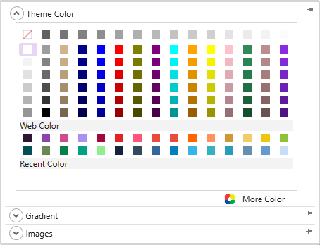
5 Container Background

Lets you apply a preferred colour, gradient, or image to the background of the menu.
TemplateToaster features the following additional background options-
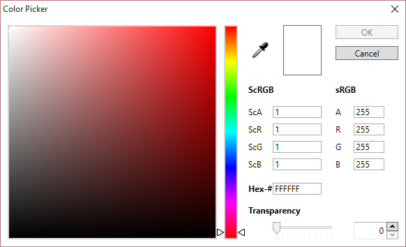
Colour Picker-
TemplateToaster gives you a colour picker to choose the background colour from. Here are the details of the Color Picker.
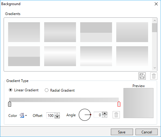
Custom Gradient-
Use this option to create custom gradients with preferred angle, colour, and offset choices. You can also save the gradients as well and use it later. See this for more information about creating and saving the custom gradients.
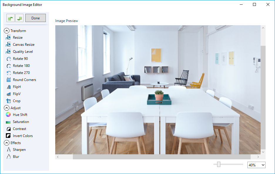
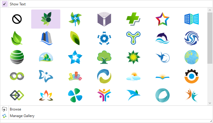
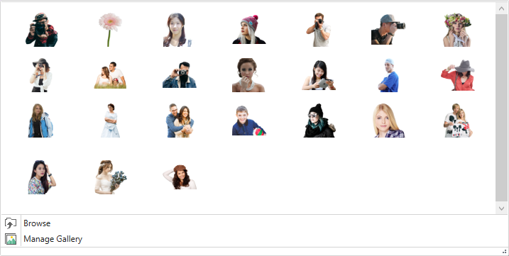
Browse Images-
You can also apply an image in the background of the menu. TemplateToaster has an inbuilt stock of free images which you can use. You can select an image from the stock, or browse your custom images also.
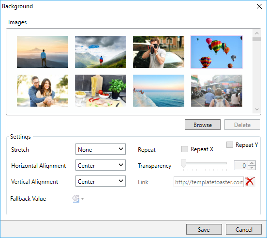
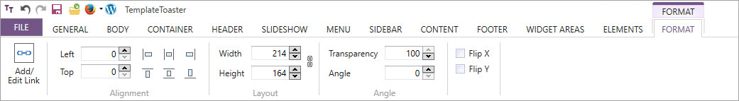
You can also edit the browsed images as needed. The TemplateToaster has an image editor with many editing options to customize the browsed images as needed. For details, see this.
6 Header Properties

Lets you customize the look and feel of the Sidebar Menu’s header. You can set the following properties that are available with header as shown below:

Icon-
You can use an icon with the header. When you click this option, you will see a small stock of icons, which are mostly used in the websites. But, if you have your custom icons, you can also browse those icons and easily add them. You can also find the option to change the colour of the icon as given below:
Margin-
This option specifies the margin of the header for all four sides.
Padding-
Lets you set the padding of the header from all sides i.e. top, bottom, left, right and more.
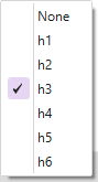
Heading Type-
Use this to select a preferred heading type for the header of the sidebar menu (H1,H2,….H6). You can also select None if you do not want to add any header type.
7 Header Background
Use this option to change the background of the sidebar menu’s header. You can choose a preferred colour, gradient, or image to apply on the background of the menu.
TemplateToaster has following options to modify the background-
Colour Picker-
You can use the colour picker to choose a color from anywhere in the template/ theme or website. Here is the full description of the Colour Picker.
Custom Gradient-
You can create custom gradients with a preferred angle, colour and offset choices. You can save the gradients as well and use it anytime later. See this for more information about creating and saving custom gradients.
Browse Images-
TemplateToaster has an inbuilt stock of free images to browse and select from. You can select an image from the stock, or browse your custom images and easily add them.
You can even edit the browsed images. TemplateToaster has an image editor with many editing options to customize the browsed images. For details, see this.
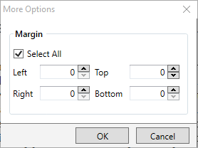
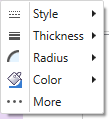
8 Header Border
Lets you customize the border of the menu’s header. You can select a preferred Style of the border, decide its Thickness, set the Radius of the edges, and choose the colour you want.
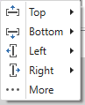
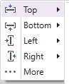
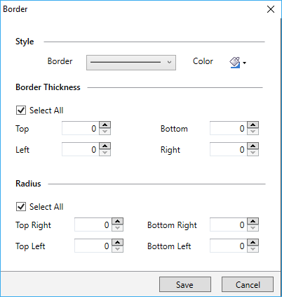
More-
The “More” lets you explore different options for designing interactive borders. You can set different values of Thickness and Radius for the individual side and edge of the border as shown below.
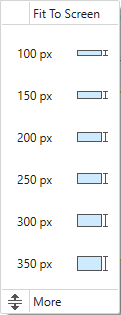
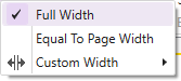
9 Header Height
Use this to specify the height of the menu’s header.

More-
Use the “More” option to specify custom height of the menu’s header.
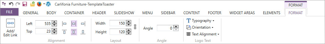
10 Header Typography

Use this to define the typography of the sidebar menu’s header. The typography includes options to choose the font, style, font size, font colour, font effect, text alignment and text decoration.

More-
With “More” option, you can open all the typography options in a single window as shown below.:

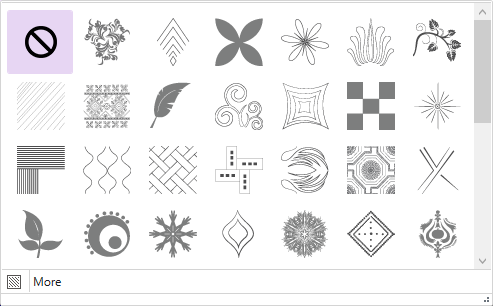
11 Header Texture
Use this to apply a texture to the background of the menu’s header.

More-
You can customize the transparency of texture with the “More” option.
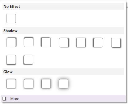
12 Header Effects
This option lets you apply an effect on the background.
More-
You can customize the transparency of the effect with “More”.
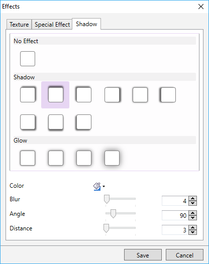
13 Header Shadow
This is to apply a shadow effect on the header background.
More-
With the “More” option you can even customize the color, angle, blur, and distance of the shadow effect as shown below:
14 Menu Button Properties

This option lets you set the properties of the menu button. You can use it to apply separator between menu buttons, change its height, width, margin padding, specify content margin and more.

15 Menu Button Background
Use this option to change the background of the Menu Buttons. You can separately apply the background for different states of the menu buttons. Such as Normal state, Hover state, and Active State.

16 Menu Button Border
Lets you design the border of the Menu Button. This option expands a drop down list of options to design the border for different states of a menu button, like Normal, Hover and Active. So, you can differently design the border of a menu button for these three states and give it a whole new look and feel.

17 Menu Button Typography

You can define the typography for the menu buttons. Thus you can set different text styles for the menu button in Active, Normal, and Hover states.

18 Expand (Submenu)
Use this option to expand the submenu. It gives you two choices to expand the submenu Horizontally and Vertically as follows:
Change the way the menu opens up when you hover. If you select this option, the menu will open up in horizontal direction, as shown below:

If you select this option, the menu will open up in a vertical direction, as shown below.

19 Open (Submenu) On
Use this option to specify whether the menu will open on click or on hover.

20 Submenu Layout
Gets active only when you select to expand the menu horizontally. With this, you can choose Mega, Vertical, or Horizontal style for the submenu layout.

21 Submenu Container
Specifies the properties of the submenu container. You can change the background, border, and apply the shadow effect of the submenu container.

22 Submenu Item
Use this to specify the properties of the submenu items such as height, width, background, border, shadow, and more.


