The name of the Widget Area tab changes according to the CMS platform you select. Although it serves the same purpose, however the name will change as follows:
Widget Areas:- For WordPress, WooCommerce
Module Position:- For Joomla
Block Reference:- For Drupal, Magento, OpenCart, Prestashop, VirtueMart
Widget Areas/Module Position/Regions/Block Reference Tab

1 Add Row
![]()
This option lets you add a Row. You can select the position where you want to add the new row as shown below:

2 Columns
![]()
Lets you specify the number of Module-Positions/Widget-Areas/Regions (Columns) in a position row/bar.
3 Shadow
![]()
You can give a shadow effect to the background of the position bar.
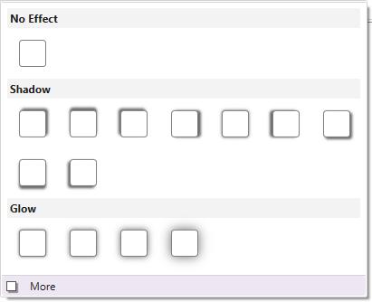
More –
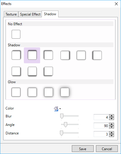
You can use the “More” option which lets you customize the colour, angle, blur, and distance of the shadow effect. Here are the more details.
4 Background

Use this option to choose a preferred colour, gradient, or image and apply it to the background of the selected position bar.
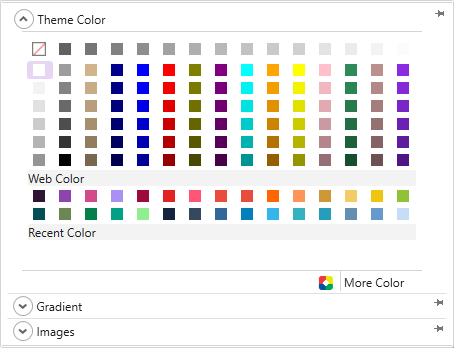
TemplateToaster provides you with the follow additional background options-
Color Picker-

TemplateToaster gives you a color picker to choose a background colour just the way you want it to be. Here is the full description of the color picker.
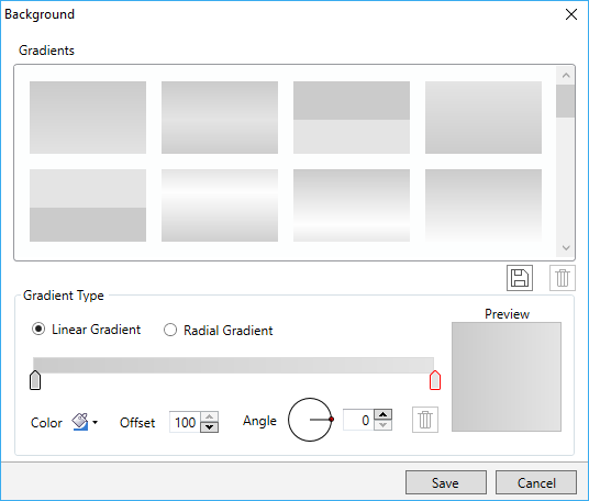
Custom Gradient-
You can create custom gradients with the preferred angle, colour and offset choices. You can save the gradients as well and use it any time later. See this for more information on creating and saving the custom gradients.
Browse Images-
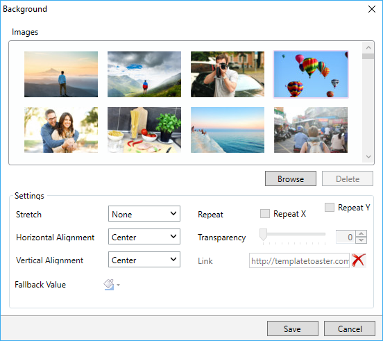
You can even apply an image to the content background. TemplateToaster has an inbuilt stock of free images to choose from. You can select an image from the stock, or browse your custom images and add it as needed.
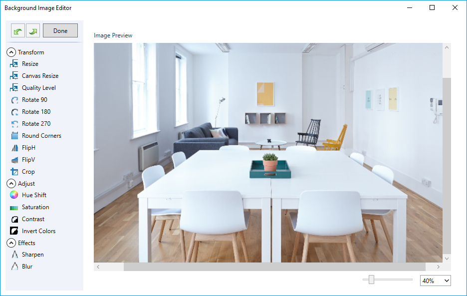
You can even edit the browsed images. TemplateToaster has an image editor with many options to edit and customize the browsed images. For details, see this.
5 Border
![]()
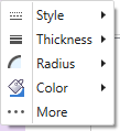
You can also mark the border around the position bar. Also, you can choose the preferred style, thickness, radius of edges, and colour of the border. See this to know the usage of every option given for designing the border.
6 Margin
![]()

Lets you specify a custom margin for the position bar from top, bottom, left, and right sides.
7 Padding
![]()

You can also specify a custom padding for the position bar.
8 Width
![]()
Use this to mention the width of the widget equal to Container width, Full width or custom (user-specified width).

9 Add Cell
![]()
Lets you add a cell to the selected position bar. Just select a position bar in which you want to add a cell and name it. Then, click OK.

10 Background

You can also change the background of a selected cell of the position bar. And apply a preferred colour, gradient, or image to the background of the cell.

11 Border
![]()
Lets you mark a border around the selected cell of a position bar/ position row. You can also set a preferred style, thickness, radius of edges, and colour of the border.

12 Shadow
![]()
This option gives a shadow effect to the background of a position cell.

More –
You can use the “More” option to even customize the colour, angle, blur, and distance of the shadow effect. Here are the more details.

13 Margin
![]()
Use this to specify the margin for each side of the selected position cell.

14 Padding
![]()
You can use this option to specify the padding for each side of the selected position cell.

15 Width
![]()

Lets you specify the width of the selected cell. You can change the width of an individual cell according to the need of design. To change the width, just select the cell and click on this option.
16 Widget Areas

You can draw the custom positions in the header, menu, slideshow, and footer. Also you can drag it to any position of the selected element.
17 Background

Use this option to change the background of a custom drew widget area/ module position/ region/block. You can also apply a preferred colour, gradient, or image to the background of selected widget area/module position/ region/block.

18 Border
![]()

Use this option to mark the border around the widget area/ module position/ region/ block you’ve drawn. You can also set a preferred style, thickness, radius of edges, and colour for the border.
19 Left
![]()
You can specify the selected Widget Position with respect to the left side. And also change the positioning of a widget from left.
20 Top
![]()
Use this to specify the selected Widget Position with respect to the top position. You can change the positioning of a widget from the top by clicking on this option.
21 Height
![]()
Lets you specify the height of the selected widget. You can change it as per your need.
22 Width
![]()
Use this option to specify the width of the selected widget. You can change it as required.
23 Widget Positions

Use the Shortcuts for the different widget positions for the user convenience. The given positions are as:
Horizontal (Left, Center, & Right)
Align Left to Page
Vertical (Top, Center, & Bottom)
Align Right to Page