Author Archives: TemplateToaster

4.18.3 Color Picker Dialog Box

1 Dropper

This is such a cool option that lets you pick a desired colour from anywhere. Simply use the dropper to pick any colour.

2 ScRGB

ScA-
It is used to set ScRGB alpha channel value of the colour.
The alpha channel of a Colour structure determines the amount of transparency the Colour has. An alpha value of 1 indicates the Colour is completely opaque and a value of 0 indicates the colour is completely transparent. So you can choose according to the transparency needed.

ScR-
Sets ScRGB red channel value of the colour.

ScG-
Specifies the ScRGB green channel value of the colour.

ScB-
Sets ScRGB blue channel value of the colour.

3 sRGB

It stands for “Standard RGB” (and RGB stands for Red-Green-Blue”). All the colours you see on your computer display, are a mix of red, green, and blue colours which is the sRGB.

4 Hexadecimal

Allows you to input any valid hexadecimal value of a colour.

5 Transparency

You can also set the transparency for the colour according to your requirement.

4.18.2 Custom Fonts Dialog Box

You can use this option to create a new custom typography scheme.  By using the Custom fonts dialog box you can easily create a new custom typography scheme as you want.

1 Google Web Font

Use this to display a drop- down list of the Google web fonts that can be used on web pages without any crash limitation. You can select any of these.

Browse-

You can also browse more fonts by clicking on the Browse button. A window will open as shown below:

From here you can directly move to the Google fonts website to choose your preferred web font. And enter the name of the selected font in the given text box and choose script type. Lastly you need to Save it. It will be added to the Google web fonts list of TemplateToaster.

2 Custom Fonts
It is a drop-down list of custom fonts and you can select any preferred font of your choice. You can even browse your own custom fonts by using the Browse button that will help you find the required file that you want to upload. And it will be added to the current list of fonts.

3 System Fonts

This shows a drop- down list of primary fonts that are available with the operating system. You can choose any font as you need.

4 Add Font
Use this option to add your selected font style to the main typography list.

4.18.1. More Schemes Dialog box

1 Color Scheme

You can make your own new colour scheme by choosing preferred colours as you require. This is an amazing option as it lets you set the look and feel of the template/theme or website design as you want.

2 Color Scheme Name

Give a specific name to your colour scheme in this text field.

3 Save

You can create as many colour schemes as you want. And save with their unique names using this option. Thus you can use these colour schemes later as well.

4 Close

Click on the close button to drop the changes and close the dialog box.

4.18 Dialog Boxes in TempalateToaster

A dialog box is a small area on the screen in which you are prompted to provide information or select commands as you require. TemplateToaster provides the following dialog boxes:

Theme Color
Custom Fonts Dialog
Color Picker
Gradient
Background Images
Texture
Effects
Shadow
Border
Website Typography
Picture
Video
More Options
Contact Form
Scroll Up Button
Hyperlink

4.17 Format Tab in TemplateToaster

This ‘Format Tab’ will open when the user Double Clicks on the Designer text in the Footer section. It includes various options to style the Designed By element of the footer as follows :

1 Left Alignment

Allows the user to set the X coordinate of the Designed By element from Left side.

It also provides the direct positioning of the element in three different ways as shown below:
Horizontal Left
Horizontal Center
Horizontal Right

2 Top Alignment

You can specify the Y coordinate of the element by taking Top as origin.

It also provides three different positions to set the element directly as shown below:
Vertical (Top, Center, & Bottom)

3 Link Typography

Use this to define the typography of the Designed by Link by specifying the Style, Font Size, Color, Text Decoration, and much more.

4 Text Typography

You can customize the Designed by Text by specifying the Font Family, Colour, Effects, Text Decoration, and much more.

5 Link Preferences

Use this option to specify the Footer Link of the page that you want to open when a user clicks on this Designed by element. In addition, you can also specify whether the link will open in the same window or should use the New window in the Footer OpenIn field. These are the two ways you can select link preferences.

4.16 Editor Tab in TemplateToaster

The “Editor Tab” offers a number of editing tools to modify and customize the content in WordPress, HTML, Prestashop, Magento, and many other CMSs before exporting the theme/template.

1 Undo and Redo

These are the editing commands that you can use to make your task easier. Undo (Ctrl+z) reverses the most recent edit you have done. This control helps the user to restore the last deleted text. Redo (Ctrl+y) can restore the changes that are undone using Undo. For example, if some text was added, Undo will remove it. While the Redo command will add it again.

2 Font

You can use this option to browse fonts from here. And also choose any type of font for your template/ theme or website as TemplateToaster supports Google Fonts, System Fonts, and Custom Fonts.

3 Font Style

TemplateToaster supports dynamic font style. Hence, you can select a preferred style for your chosen Font.

4 Font Size

Select the text and use these options to increase/ decrease the size of the selected text.

5 Font Tools

You can also customize the style and colour of the text with font tools.

6 Paragraph Formatting Tools

These tools allow you to align the text, set the indentation, specify line-height, margin and draw a horizontal outline below the text as required.

7 Image

Use to to add a custom image (s) in the content box. Place the cursor where you want to insert the image and then click on this button. For comprehensive knowledge about adding an image, view this.

8 Video

Use this option to add a YouTube video(s) in the content box. Place the cursor where you want to insert the video and then click on this button. For more details about adding a video, view this.

9 Button

Use this to insert the button. Place the cursor where you want to place the button and then click on this option. You can personalize the button according to your design with Elements Tab. See this, for complete information.

10 Contact Form

You can add up a contact form in your template/ theme or website. Place the cursor where you want to place the contact form and then click on this option. You can even customize the typography of labels and can select the Button Type that is to be used in the form. See this, for more details.

11 Hyperlink

Lets you add a link that redirects to another website or internal page of the website. Select some text, click the Hyperlink button and enter the valid URL and then press OK. Here are the more details.

12 Table Options

With the Table options you can add or delete the tables. And, you can also add/delete rows and columns in the selected table. When you click “Table” option, following dialog box opens up, from which you can choose formatting options.

4.15 Elements Tab in TemplateToaster

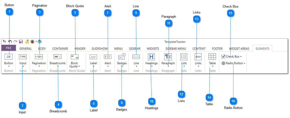
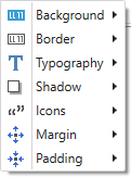
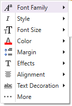
The Elements Tab contains the options for designing different user interface elements for the template/theme or website such as Button, Input Field, Pagination, Breadcrumb and more. Let us go through all the given options and how you can use them to change the look and appeal of your design.

1 Button

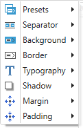
When you click on the Button option it displays a dropdown list as shown below.. All the options are explained as follows:
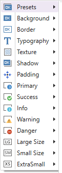
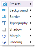
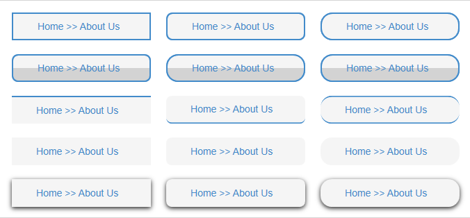
Presets-

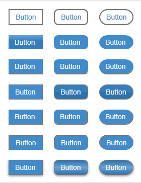
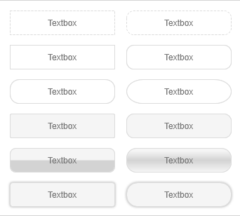
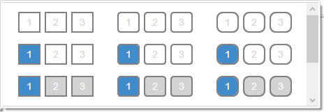
With the Presets option, you can find a set of predesigned buttons to choose from. You can select any predesigned button for your template/theme or website and can change its look and feel as per your need. For this, you can select following options given by TemplateToaster:
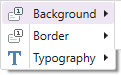
Background-

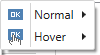
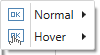
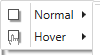
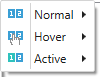
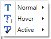
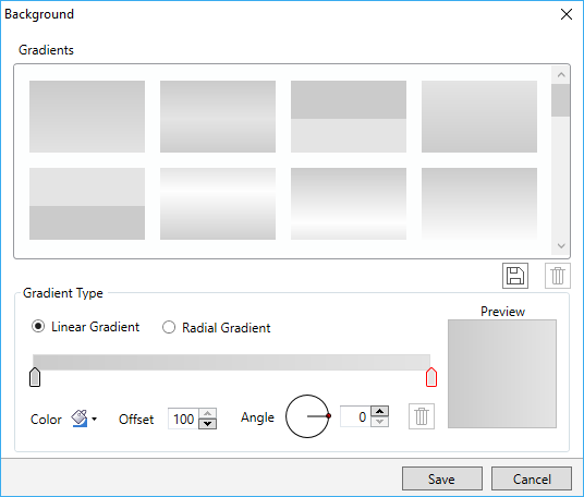
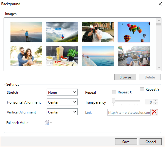
You can also change the background for the buttons and set it as Normal and Hover states. You can apply colour, a gradient, or an image in the background of the button.
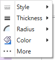
Border-

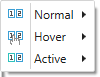
Use this to design the border of the buttons. For a more professional look and feel of the buttons, you can choose different borders also for Normal and Hover states.

Typography-

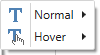
Lets you change the text style or typography of the buttons. You can apply different text styles on buttons as Normal and Hover states.

Texture-

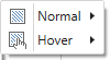
You can apply a texture effect to the background of the buttons.

Padding-

Lets you specify the padding of the footer from all the sides.

Primary/Success/ Info/ Warning/ Danger-

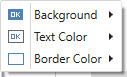
You can design five types of BOOTSTRAP buttons with TemplateToaster: Primary, Success, Info, Warning, and Danger. For designing these buttons, Template Toaster offers Background, Text Colour, and Border Colour options.

Large Size/ Small Size/ Extra Small-

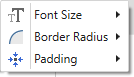
Also Modifies the Font size of all size buttons ( Large, Small and Extra Small). You can easily change their border radius and padding as well.
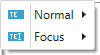
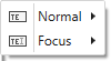
2 Input

Input is a type of form control that BOOTSTRAP offers. You can design this control with the following options.

Presets-

Lets you select a preset style and then also modify its look and feel.

Background-

Use this to modify the background of an Input box. You can set different backgrounds of the box for Normal and Focused states.

Border-

Use this to design the border of an Input box. You can design different borders of the box for Normal and Focused states.

Typography-

Lets you define the preferred text style for an Input box. You can set different text styles for Normal and Focused states of the Input box.
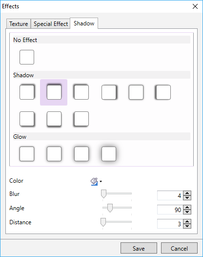
Shadow-

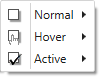
Lets you apply a shadow effect to the input box. You can also set different shadow effects for the Normal and Hover States.
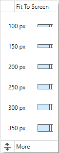
Height-

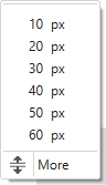
You can also specify the height of the Input box. With the “More” option you can even specify the custom value for the height.

Width-

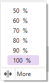
Use this to set the width of the Input box. With the “More” option you can also specify the custom value for the width also.

3 Pagination

Use this for styling the pagination of your template/website.

Presets-

Allows you to select a preset style of pagination and then modify its look and feel.

Background-

Use this option to change the background of the pagination for its different states. Just select the state of pagination for which you want to change the background and apply a preferred colour, a gradient, or an image on the background of the pagination.

Border-

You can design the border of pagination using this option. The border can be designed differently for the Normal, Hover and Active state of pagination.

Typography-

Lets you define the preferred text style for the pagination. You can also set different text style for Normal, Hover and Active state of the pagination.

Shadow-

Use this option to apply a preferred shadow effect to the pagination. Also you can apply different shadow effects for the Normal, Hover and Active states.

Margin-

Lets you specify the margin of the pagination.

Padding-

Use this to specify the padding of the pagination.

4 Breadcrumb

Lets you design the breadcrumb navigation of your template/ website just the way you want.

Presets-

You can choose a preset style of breadcrumb navigation and then modify its look and feel as you want.
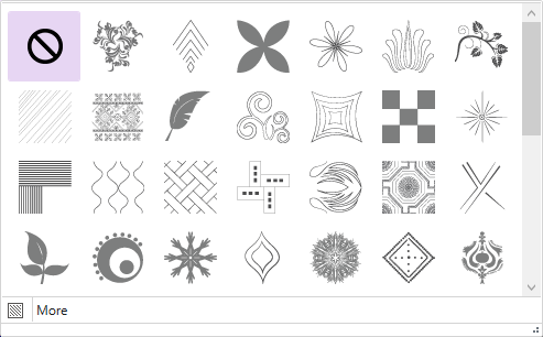
Separator-

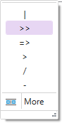
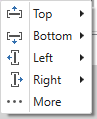
Use this to select a separator icon for breadcrumb.
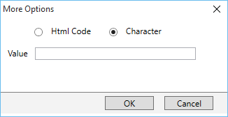
More-
The “More” option allows you to specify a custom breadcrumb icon.

Background-

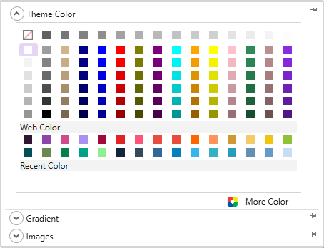
Use this to change the background of a breadcrumb. You can also apply a preferred colour, a gradient, or an image to the background of breadcrumb.

Border-

For designing the border of breadcrumb as per your need.

Typography-

You can also define the text style of the breadcrumb in the Normal, Hover and Active states.

Shadow-
Use this to give a shadow effect to the breadcrumb.

Margin-

Lets you set out the margin of a breadcrumb.

Padding-

Use this to add up the padding of a breadcrumb.

5 Block Quote

Use this option to design the Block Quote element of your template/ theme or website design.

Background-

Lets you modify or change the background of a Block Quote. You can apply a preferred colour, a gradient, or an image to its background..

Border-

You can design the border of a Block Quote as per your need.

Is Default:
Use this to set or apply a default style.

Typography-

You can define the text style of a Block Quote element. Also you can choose the Font from preferred Font Family, choose a style for the Font, and much more.

Shadow-
Lets you apply a shadow effect to the Block Quote.

Icons-

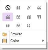
You can also select the preferred icons for a Block Quote. And even browse your own custom icons and set preferred colour to those icons.

Margin-

Lets you specify the margin of a Block Quote.

Padding-

Use this to specify the padding for a Block Quote.

6 Label

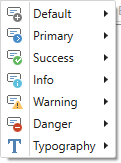
TemplateToaster allows to customize six BOOTSTRAP Labels, which are: Default, Primary, Success, Info, Warning and Danger. You can customize their background and text style in Normal and Hover states.

7 Alert

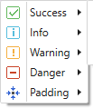
You can customize  the BOOTSTRAP Alert messages. Lets you change the Background, Border, and Typography of each type of an Alert message.

8 Badges

With this option, you can customize the BOOTSTRAP badges used in the template/ theme or website design. You can also change the background of a badge, design its border, and change its typography as well.

Background-

In addition, you can apply different backgrounds to the badges for Normal and Active states. Also you can set a preferred colour, a custom gradient or a custom image. Moreover choose a gradient and any image from the free stock of TemplateToaster.

Border-

Lets you design the border for badges with available options.

Typography-

You can also change the text style of badges for Normal and Hover states.
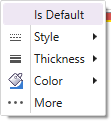
9 Line

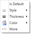
Use this to design the Lines used in your template/ theme or website. You can choose Style, Thickness, and Colour of the line as you desire.

Is Default-
Check this option to apply the default style.

10 Headings

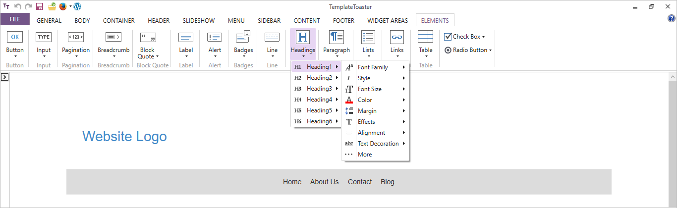
Use this to select the typography of Headings from H1 to H6 including colour, font size, alignment etc.

11 Paragraph

Lets you define the typography for the paragraphs.

12 Lists

Use this to set the typography for both the ordered and unordered lists.

13 Links

Sets the typography for links on the Active, Normal and Hover states.

14 Table

You can also specify the typography of any table inserted on the page.

15 Check Box

Lets you modify the appearance of the default checkbox as you need.
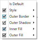
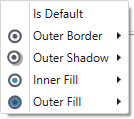
Is Default-
Make sure to check this option if you want to apply the default style.

Style-

You can choose from two  different Style options as- Check and Fill.

Outer Border-

Use it to design the outer border of the checkbox.

Outer Shadow-

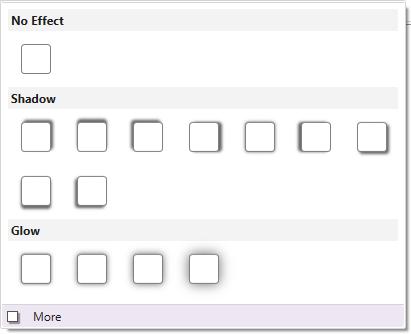
Lets you apply a preferred shadow effect to the checkbox.

Inner Fill/ Outer Fill-

Lets you add or change the checkbox fill. You can choose different colour/ gradient/ or image for inner and outer fills.

16 Radio Button

Use this to modify the look and feel of a radio button.

Is Default:
Check this option to apply a default style.

Outer Border-

Lets you design the outer border of a checkbox.

Outer Shadow-
You can apply an outer shadow to the checkbox.

Inner Fill/ Outer Fill-

Use this to  add or change the Radio Button fill. Also you can choose a different colour/ gradient/ or image for inner and outer fills.

4.14 Widget Areas/Module Position/Regions/Block Reference Tab

The name of the Widget Area tab changes according to the CMS platform you select. Although it serves the same purpose, however the name will change as follows:

Widget Areas:- For WordPress, WooCommerce
Module Position:- For Joomla
Block Reference:- For Drupal, Magento, OpenCart, Prestashop, VirtueMart

Widget Areas/Module Position/Regions/Block Reference Tab

1 Add Row

This option lets you add a Row. You can select the position where you want to add the new row as shown below:

2 Columns

Lets you specify the number of Module-Positions/Widget-Areas/Regions (Columns) in a position row/bar.

3 Shadow

You can give a shadow effect to the background of the position bar.

More –
You can use the “More” option which lets you customize the colour, angle, blur, and distance of the shadow effect. Here are the more details.

4 Background

Use this option to choose a preferred colour, gradient, or image and apply it to the background of the selected position bar.

TemplateToaster provides you with the follow additional background options-

Color Picker-

TemplateToaster gives you a color picker to choose a background colour just the way you want it to be. Here is the full description of the color picker.

Custom Gradient-
You can create custom gradients with the preferred angle, colour and offset choices. You can save the gradients as well and use it any time later. See this for more information on creating and saving the custom gradients.

Browse Images-

You can even apply an image to the content background. TemplateToaster has an inbuilt stock of free images to choose from. You can select an image from the stock, or browse your custom images and add it as needed.

You can even edit the browsed images. TemplateToaster has an image editor with many options to edit and customize the browsed images. For details, see this.

5 Border

You can also mark the border around the position bar. Also, you can choose the preferred style, thickness, radius of edges, and colour of the border. See this to know the usage of every option given for designing the border.

6 Margin

Lets you specify a custom margin for the position bar from top, bottom, left, and right sides.

7 Padding

You can also specify a custom padding for the position bar.

8 Width

Use this to mention the width of the widget equal to Container width, Full width or custom (user-specified width).

9 Add Cell

Lets you add a cell to the selected position bar. Just select a position bar in which you want to add a cell and name it. Then, click OK.

10 Background

You can also change the background of a selected cell of the position bar. And apply a preferred colour, gradient, or image to the background of the cell.

11 Border

Lets you mark a border around the selected cell of a position bar/ position row. You can also set a preferred style, thickness, radius of edges, and colour of the border.

12 Shadow

This option gives a shadow effect to the background of a position cell.

More –
You can use the “More” option to even customize the colour, angle, blur, and distance of the shadow effect. Here are the more details.

13 Margin

Use this to specify the margin for each side of the selected position cell.

14 Padding

You can use this option to specify the padding for each side of the selected position cell.

15 Width

Lets you specify the width of the selected cell. You can change the width of an individual cell according to the need of design. To change the width, just select the cell and click on this option.

16 Widget Areas

You can draw the custom positions in the header, menu, slideshow, and footer. Also you can drag it to any position of the selected element.

17 Background

Use this option to change the background of a custom drew widget area/ module position/ region/block. You can also apply a preferred colour, gradient, or image to the background of selected widget area/module position/ region/block.

18 Border

Use this option to mark the border around the widget area/ module position/ region/ block you’ve drawn. You can also set a preferred style, thickness, radius of edges, and colour for the border.

19 Left

You can specify the selected Widget Position with respect to the left side. And also change the positioning of a widget from left.

20 Top

Use this to specify the selected Widget Position with respect to the top position. You can change the positioning of a widget from the top by clicking on this option.

21 Height

Lets you specify the height of the selected widget. You can change it as per your need.

22 Width

Use this option to specify the width of the selected widget. You can change it as required.

23 Widget Positions

Use the Shortcuts for the different widget positions for the user convenience. The given positions are as:
Horizontal (Left, Center, & Right)
Align Left to Page
Vertical (Top, Center, & Bottom)
Align Right to Page

4.13. Footer Tab

1 Presets

Shows a set of predesigned styles of the footer for you to choose from. You can select from the predesign style options and modify its look as per your need.

2 Layout

Provides you a choice either to display the footer in your template/website or not. Additionally, TemplateToaster also lets you make sticky footer if you need it. You can choose from given footer layout options that best suit your design.

3 Background

Lets you choose a preferred colour, gradient, or image to apply to the background of the footer. Also TemplateToaster features the following additional background options to make your design look fantastic:

Color picker-
TemplateToaster gives you a color picker to choose a background colour as suitable. Here are the details about the color picker.

Custom Gradient-
You can create custom gradients with the preferred angle, colour, and offset choices. You can save the gradients as well and use it later. See this to learn information about creating and saving the custom gradients.

Browse Images-
You can apply an image in the background of the footer as well. TemplateToaster has an inbuilt stock of free images. You can even browse and then edit those custom images and use it in the footer.

TemplateToaster has an image editor with so many option to edit and customize the browsed images. For detailed information, see this.

4 Height

Lets you specify the height of the footer.

More-
Use the “More” option to specify the custom height.

5 Width

You can use this option to change the width of the footer. For this three options are available to specify the width of the footer as given below:

Full Width- Use this to set the width of the footer equal to the width of the browser window.

Equal To Page Width- Makes the width of the footer equal to the width of the page. This option is selected by default but you can change it also.

Custom Width- Lets you mention the custom width of the footer as per your need.

Note: If you have chosen Fixed Width Layout for your template/website, you can set the custom width in pixels. Otherwise, if you have chosen Fluid Width Layout, you can set the custom width in percentage(%).

6 Border

Use this option to design the border of the footer and make it look appealing. You can use Style, Thickness, Radius, and Colour options to customize the border as you want.

More-
The “More” option lets you display even more border customization options. See this to know the usage of every option given for designing the border.

7 Margin

You can specify the margin of the footer for all the sides i.e. top, bottom, left, and right.

More-
You can also specify the custom margins with the “More” option.

8 Texture

Lets you apply a texture to the footer background.

More-
You can also customize the transparency of texture with the “More”. Here are more details on this.

9 Effects

You can also apply an effect on the footer background.

More-
Lets you customize the transparency of the effect with the “More” option. Here are the more details.

10 Shadow

You can also give a shadow effect to the footer background.

More-
With the “More” you can even customize the colour, angle, blur, and distance of the shadow effect. Here are the details.

11 Image

Besides the header background image, TemplateToaster allows you to insert foreground image(s) in the footer to make the template/ website look more professional and amazing. You can apply an image on the footer foreground using this option.

More-
Use the “More”  to link the image to a custom URL. The link can be configured to open in a new window. If you need, you can change the transparency of the image and rotate it around the X or Y axis.

12 Text Areas

Lets you draw the text areas on the footer. You can also add custom text, image, and video in your text area as needed. Just “double click” on the text area to modify its dimensions, add text, add a background image, colour, and a lot more. Text formatting can also be done.

13 Background

Displays a dialog box as shown below. From here, you can apply a colour, gradient, and even an image in the background of a Footer Row.

14 Margin

Use this to specify all of the margins (Top, Bottom, Right, Left) for the Footer Row.

15 Padding

Lets you set the padding for the Footer Row.

16 Add Cell

You can also add a Footer Cell in the position bar of the footer area. You can add as many cells as you require.

17 Delete a Cell

Use this option to delete a cell from the position bar of the footer area.

18 Width

Lets you specify the width of the footer cell. You can change the width of an individual cell according to the need of the design. To change the width, just select the cell and click on this option.

19 Columns

Use this to specify the number of columns you want, in the position bar of the footer area.

20 Border

Lets you design the border of the footer cell. You can use Style, Thickness, Radius, and Colour options to customize the border.

More-
You can use the “More”  option to display more border customization options. See this for details.

21 Margin

Lets you specify the margin of the footer cell for all the sides i.e. top, bottom, left, and right.

More-
You can use this option to specify the custom margins with “More”.

22 Padding

Use this to specify the padding for the Footer Cell from all the sides (Top, Bottom, Left, Right).

23 Show/Hide Copyright

Gives a choice either to hide or show the copyright text in your template/ theme or website design.

24 Designed by Text

Use this to hide/show the “Designed by” text in your template/  theme or website design.

25 Designed By Link

Gives the choice to hide/show the “Designed by” link in your template/ theme or  website design.

26 Social Icons

You can configure social media accounts in the footer of your template, theme or website. For this, you can choose the icons from the inbuilt icon gallery or you can browse your own custom social media icons and easily add them also.

27 Typography

Lets you define the typography for the Headings, Text, Lists, Links of the footer area.

Headings

Use this to edit the text style of the headings used in the footer. You can also do following changes like Font Family, Style, Colour etc. in the typography of the headings.

Text

Use this option give a personalized look and feel to the text styles of any plain text that you’ll write in the footer area.

Lists

Usually lists provide a much better way to display data. You can create both, ordered and unordered lists in your template, theme or website. An ordered list is represented with numbers, alphabets while an unordered list with Bullets, Disc, etc. Using this option, you can format the styles of ordered/unordered lists.

Links

Lets you easily set the typography for links in the footer section for all the three states as Active, Normal, Hover. You can also make the following changes to customize a typography pattern.

Here as shown above the ‘More’ option allows you to choose the text format and effects for font.

4.12.10. Content Tab for VirtueMart in TemplateToaster

1 Background

Use this option to apply a preferred colour, gradient, or image to the content background as you require.

TemplateToaster features the following additional background options for you to choose and customize the look and feel of the background:

Colour Picker-

TemplateToaster provides a color picker to choose a background colour. Here is the full description of it.

Custom Gradient-
You can create custom gradients with preferred angle, colour, and offset choices. You can save the gradients as well and use it anytime later. See this for more information about creating and saving the custom gradients for future use.

Browse Images-
You can even apply an image to the content background. TemplateToaster presents an inbuilt stock of free images to choose from. You can also select an image from the stock, or browse your custom images and add it.

You can even edit the browsed images as needed. TemplateToaster has an image editor with many options  to edit and customize the browsed images. For details, see this.

2 Border

Use this option to mark the border around the content and modify its properties such as Style, Thickness, Radius and Colour. See this to know more.

3 Margin

Lets you specify the margin of the content for all the sides i.e. top, bottom, left, and right.

4 Padding

You can also specify the padding from the top, bottom, left, and right padding of the content.

5 Texture

Use this to apply a texture to the content background.

More-
You can use this option to customize the transparency of texture with “More”. Click Here for more details.

6 Effects

Use this to give an effect to the content background.

More-
You can use this to customize the transparency of the effect using the “More” option. Click Here for more details.

7 Shadow

Lets you apply a shadow effect to the content background.

More-
With the “More”, you can even customize the colour, angle, blur, and distance of the shadow effect. Click Here for more details.

8 Background

You can also apply a preferred colour, image, or gradient in the background as needed. TemplateToaster provides predesigned gradients and stock images. Also, you can create the custom gradients or browse your own images.

9 Border

You can also mark the border for the product which you can customize also. For customizing the border, you can have Style, Thickness, Radius (of edges), and Colour options.

10 Margin

Lets you specify all side margins i.e. Top, Bottom, Left and Right.

11 Padding

You can also specify the padding from all the sides i.e. Top, Bottom, Left and Right.

12 Texture

Lets you apply a texture to the background of the product.

More-
You can also customize the transparency of texture with the “More” option.

13 Effects

You can apply an effect to the background of the product.

More-
You can customize the transparency of the effect using the “More” option.

14 Shadow

Use this to apply a shadow effect to the background of the product.

More-
With the “More” option you can even customize the colour, angle, blur, and distance of the shadow effect.

15 Title

You can use this to set the typography of the Product Title Container.

16 Content

Lets you customize the Product Content by specifying different properties like Background, Border, List layout, Typography, and much more as shown below:

17 Columns

You can specify the number of product columns on a single page.

18 Image Border

Allows you to customize the product image border by specifying its Thickness, Style, Color etc.

19 Cart

Lets the user specify the style and alignment of the Add To Cart button as per user preferences.

20 Price

Use the Text styling of Product Price by specifying different properties like Font Family, Thickness, Colour, and much more.

21 Links

You can define the typography of post title, metadata, metalinks, and content for different states like Link and Link Hover and align the links.