
1 Presets

You can find the pre-designed styles of the menu. You can also select the predesigned menu options, and customize its looks as needed for the template/theme or website design.

2 Edit Menu

Use this option to select the pages you want to show in the menu. Simply untick the pages you do not want to show.

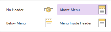
3. Menu Position

Use this option to open a ‘Sticky Menu’ option s shown below:

Sticky Menu –
A sticky menu doesn’t disappear when you scroll down the page, unlike normal menu. But it sticks to the top of the page as you scroll down the page. Hence, a sticky menu is quick to navigate for the users. TemplateToaster facilitates you to create such a sticky menu for your template/website.
4. Background

TemplateToaster provides you with various preferences to change and customize the colour, gradient, or image to apply the menu background of the template/theme or website design. You can find following advanced background options:
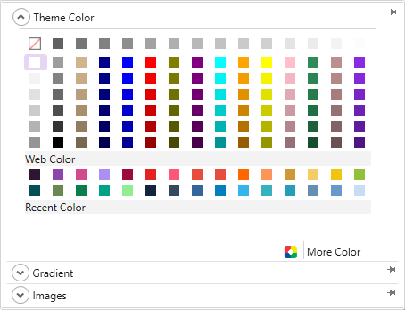
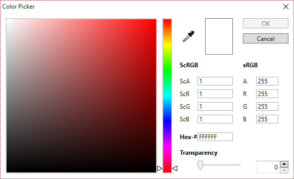
Color Picker-
TemplateToaster provides you with a Colour Picker to choose the colour as needed. Here is the full description of the colour picker.
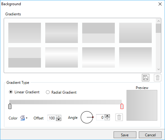
Custom Gradient-
You can create custom gradients with the preferred angle, color and offset choices. You can save the gradients as well for later use. See this for detailed information about creating and saving custom gradients.
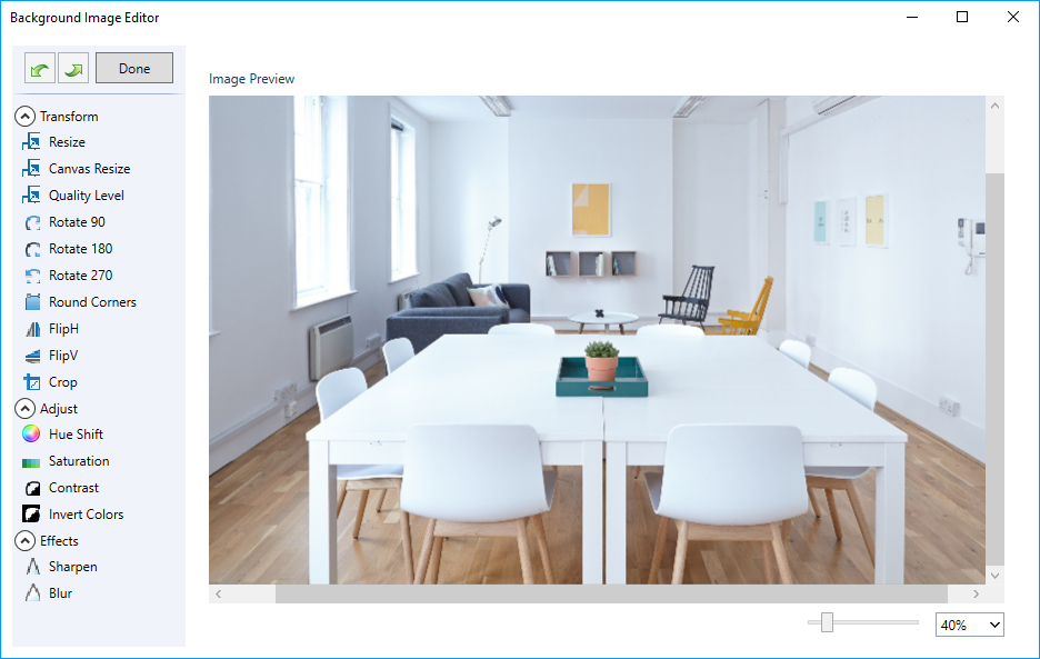
Browse Images-
Use this option to apply images to the background of the menu. TemplateToaster has an inbuilt stock of free images. You can also browse your custom images as needed.
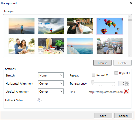
Thus you can easily edit the browsed images. TemplateToaster provides an image editor with a series of edit options to customize the browsed images. For detailed information, see this.
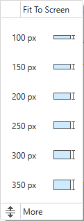
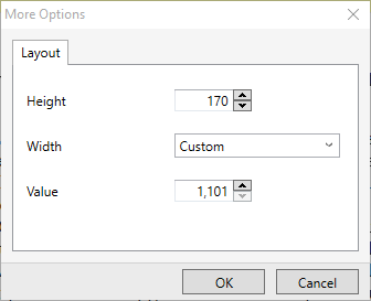
5. Height

Use this option to specify the height of the menu. You can choose the height from given below values:

More –
The “More” option allows you to specify a custom height on your own.

6. Width

The option changes the width of the menu with a single click. Here are the three option available for specifying the width of the menu as:
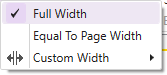
Full Width – The option makes the width of menu equal to the width of the browser window.
Equal To Page Width – You can use this option to set the width of menu equal to the width of the page. This option is activated by default.
Custom Width – Use this to specify a custom width of the menu according to your need.
Note: If you have chosen Fixed Width Layout for your template/website, you can set custom width in pixels. Otherwise, if you have chosen Fluid Width Layout, you can set custom width in percentage.
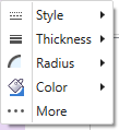
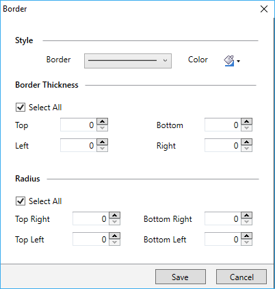
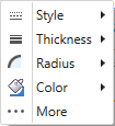
7. Border

Use this option to customize the border of the menu by specifying Style, Thickness, Radius and Color of the border.
More –
The ‘More’ option provides you with even more border customization options. See this for details.
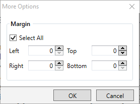
8. Margin

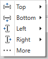
This option lets you specify the margin of the menu for all the sides (i.e. top, bottom, left and right).
More –
Use the ‘More’ option to specify the custom margins.

9. Padding

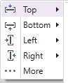
The Padding option lets you specify the white space (typically the distance) between the content and the border of the element. You can choose to set it as Top, Bottom, Left, and, Right padding of the menu using this option.
More –
Use the ‘More’ option to specify the custom padding. Simply click on the ‘More’ option.
10 Texture

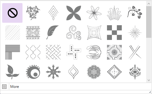
Use this option to add texture to the menu background.

More –
You can customize the transparency of texture with “More”. Here are the more details.
11 Effects

Use this option to apply an effect on the menu background.
More –
Use the ‘More’ option to customize the transparency of the effect using “More”. Here is the detail.
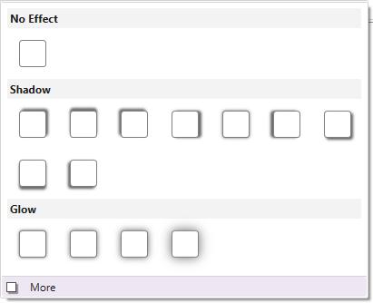
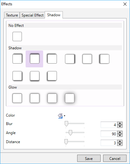
12. Shadow

This option lets you apply a shadow effect on the menu background.
More-
With “More”, you can even customize the colour, angle, blur, and distance of the shadow effect. Here, you can get more details.
13 Logo

Use this option to apply a logo of your brand on the menu. You can choose the logo from TemplateToaster’s logo stock options or you can browse your own also.
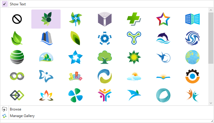
More –
You can click “More” option to browse your own logo. You can also link your logo to a URL.
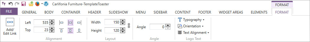
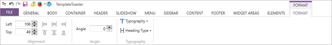
Logo Formatting –
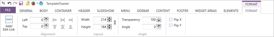
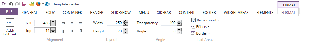
You can also format the logo. Next, click the Logo and a Format tab will appear as shown below. The format tab provides you the option to change the alignment, height, width and angle of the Logo.
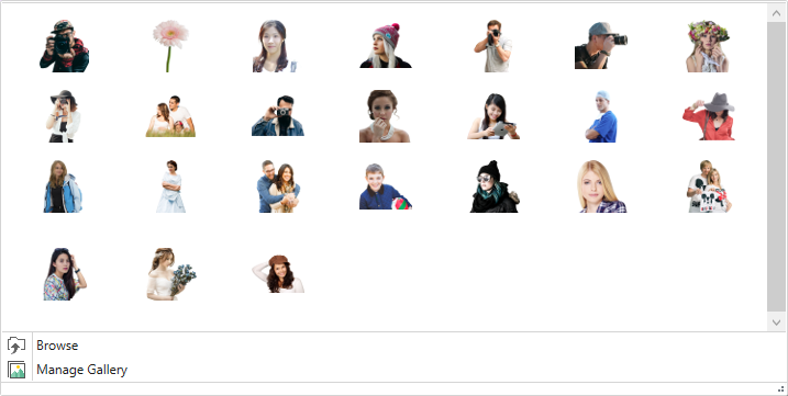
14 Foreground Image

You can add the foreground image in the menu to make the template/theme or website more professional and stunning.
More –
With the ‘More’ option you can even link the image to a custom URL. The link can be configured to open in a new window. If needed, you can change the transparency of the image and rotate it around the X or Y axis.
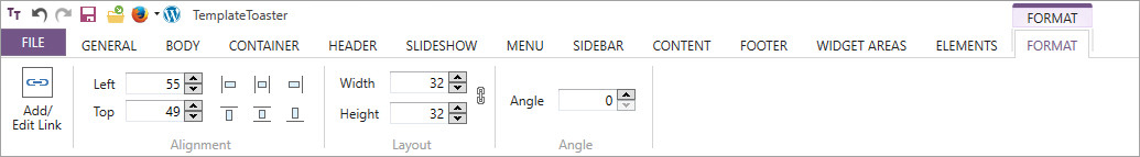
Foreground Image Formatting –
You can format the ‘Foreground Image’. For this, click the image and a Format tab will appear as shown below. This format tab provides you the options for changing the alignment, height, width and angle of the foreground image.
15 Text Areas

Use this option to draw the ‘Text Area’ in the menu. This lets you add the custom text, image, and video in the text area. Click this option and place the cursor where you want to create the text area. Simply drag the cursor and it’s done. In addition, you can also format the text area.
Text Area Formatting –
Click the text area for formatting the menu. In single click, a Format tab will appear as shown below. This format tab provides you the options to change the alignment, height, angle, and background of the text area. You can even apply effects and borders to the text area.

16. Menu Button Properties

Provides different Menu Button Properties as follows:

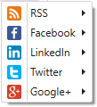
Separator-

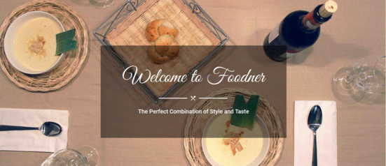
Use the ‘Separator’ option to add horizontal or vertical dividing lines. It is mostly used in Menus and Toolbars. In the above image, Grey lines in Menu depict the Separator. You can even customize the separator. For this, many options are provided to choose Style, Thickness and Color.
Height-

You can set the height of the menu according to your preference. You can choose from predefined values or you can specify a custom value. Click “More” to specify custom height of menu buttons.
Margin –
You can use this option to specify left and right margins of the menu buttons.

Padding –
Use this option to apply Padding on Menu buttons from the left and right sides.

Alignment –
Choose this option to align the menu buttons along the menu strip.

Horizontal Alignment-
Allows you to choose a preferred horizontal alignment for the menu buttons.

Vertical Alignment-
The option aligns the menu buttons vertically in three different positions.

Icon-

This option helps you to use icons with menu buttons. For this, you can also browse your own icons.

Hover to change the colour of icons for normal menu buttons. And active menu button for professional look of template/website.
Arrow –

Use this to apply an arrow with a menu item which has a submenu. You can change the thickness and colour of the arrow according to your preference.

Texture –
Easily apply the texture on the menu buttons. Texture options include Normal, Hovered and Active menu buttons separately.

Shadow –
This option is for applying different shadow effects on the menu buttons.

17. Menu Button Background

This allows you to apply different background colours for different states of a menu button.

Normal –
Use Background colour for normal or passive menu button.
Hover –
The Background colour for the menu button on hover.
Active –
Background colour for the active menu button.
18. Menu Button Border


This option lets you add and customize the border of the menu buttons. TemplateToaster lets you create different designs for various states of menu button designs.
Normal –
Use this option to choose border properties for the normal or passive menu button.
Hover –
Use the option to specify/mention the border properties for the menu button on hover.
Active –
Lets you add the border properties for the active menu button.
19. Menu Button Typography

The option allows you to define the typography of menu buttons. Also you can set different typography for different states of the menu buttons.

Normal –
Use this to set border properties for normal or passive menu button.
Hover –
Mention/specify the border properties for the menu button on hover.
Active –
Use this option to set the border properties for the active menu button.
20 Hamburger

Use this option to give the latest Hamburger look to the main menu.
21 Open (Submenu) On


The option lets you make a choice to : open sub menu on Click or open submenu on Hover. You can choose any one of these options.
22 Submenu Layout

TemplateToaster lets you make three types of submenus- Mega Menu, Vertical Menu and Horizontal Menu. You can choose as you need.

Mega –
The option creates a Mega menu for your template/ theme or website as shown below:

Vertical –
This option lets you create a vertical menu for your template/theme or website as given below:
Horizontal –
It produces a horizontal menu for your template/website or theme design as shown below:

23 Design
This option is enabled only if the Hamburger option is selected or checked. It is used to set how hamburger icon looks i.e. whether it will be in Text, Icon or Text & Icon.
Text – 
Icon- 
Text & Icon- 
24 Toggle
This lets you set different properties like Background, Border, Typography, Line, Alignment etc. at all the states Normal, Hover and Active.
25 Slide
Use this to Specify how to open the menu- Slide Down, Slide Left, Slide Right, Pop up.
26. Submenu Container


You can also customize the look and feel of the submenu container. Click this option to customize the background of submenu container, to design its border and to apply a shadow effect on it.
27 Submenu Item


You can use this option to change the properties of Submenu Item like you can do with Menu Button.
Height –
Increases/ decreases the height of the submenu items.
Width –
Increase/ decreases the width of the submenu items.
Background –
Changes the background color of the submenu items.
Shadow –
Applies the shadow effect to the submenu items.
Hover Border –
Changes the look of the border when the mouse is hovered over the submenu item.
Hover Shadow –
Applies the shadow for the Hover state of the submenu item.
Separator –
Shows separators in the submenu items.
Margin –
Specifies the margin to the submenu items according to your need.
Padding –
Applies a padding to the submenu items according to your need.
Icons –
Displays icons with the submenu buttons.
Typography –
Changes the typography of the submenu buttons.


