
1 Page Title
![]()
Allows the user to make a choice either to show or hide the Page Title. By default, this is checked but you can also unselect the option.
2 Heading
![]()
Lets you specify and add the heading. You can choose the headings as H1 to H6 for the page title for user convenience and readability purposes.

3 Typography
![]()
Use this option to define the typography of the Page Title by specifying various options like Font Family, Style, Colour, Margin and many more as shown below:

The “More” option allows the user to customize Text Formats and Effects for the Page Title.
4 Background

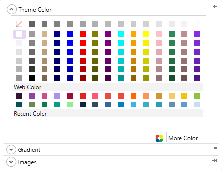
You can use this option to apply a preferred colour, gradient, or image to the background of the content of your HTML website. TemplateToaster gives following options to design the content of your website in a professional style:
Colour picker-
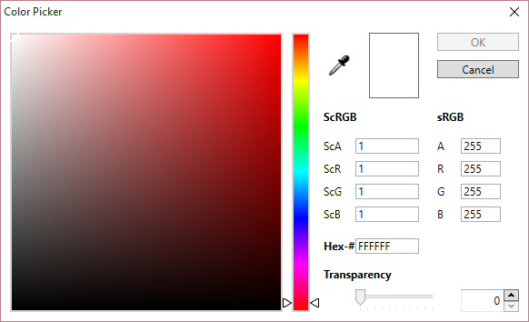
You can use the colour picker to apply background colour as required.
Custom Gradient-
You can apply a custom gradient in the background as needed. Also select the preferred angle, colour, and offset choices for creating your own gradient style. You can save the gradient for later use as well.
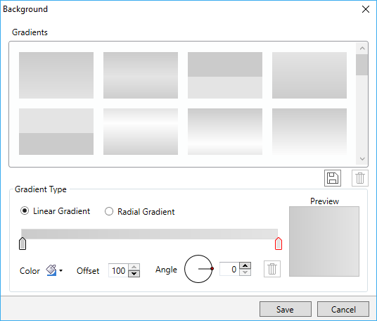
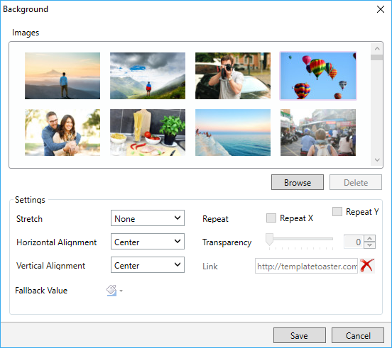
Browse Images-
You can apply an image in the background of content as you need. TemplateToaster has an inbuilt stock of free images to choose from. You can browse your custom images too and add them.
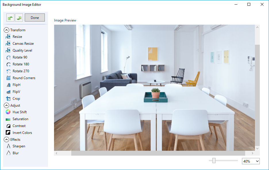
You can even edit the browsed images as needed. TemplateToaster has an image editor with many options to edit and to customize the browsed images.
5 Border
![]()
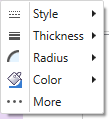
Use this to mark a border around the content area. You can set a preferred style, thickness, radius of edges, and colour for the content border.
6 Margin
![]()
Lets you set the margin for each side of the content area as needed.

7 Padding
![]()
You can specify the padding for each side of the content area.

8 Add a Row
![]()
Use this to add a row in the content area.
9 Delete a Row
![]()
You can also delete a row from the content area.
10 Columns
![]()
Lets the user specify the number of columns to keep in a row.
11 Background

You can also apply a preferred colour, gradient, or image to the background of a row.
12 Border
![]()
Use this to mark a border around the selected row of the content area. You can set a preferred style, thickness, radius of edges, and colour for the border of a selected row.

13 Shadow
![]()
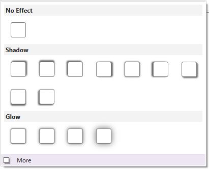
You can also apply a shadow effect to the border of a selected row.
14 Margin
![]()
You can use this to specify the margin for each side of the row.

15 Padding
![]()
Lets you mention the padding for each side of the row.

16 Add a Cell
![]()
Adds a cell in the row.
17 Delete a Cell
![]()
Deletes a cell from the row.
18 Width
![]()
Changes the width of a selected cell. You can change the width of an individual cell according to the need of your design. To change the width, just select the cell and click on this option.

19 Background

Use this to apply the background to the selected row of the content area. You can also apply a preferred colour, gradient, or image to the background of a cell.

20 Border
![]()
Marks a border around the selected cell of a row. And, you can also choose a preferred style, thickness, radius of edges, and colour for it as needed.

21 Margin
![]()
Use this to specify the margin for each side of a cell.

22 Padding
![]()
Mention the padding for each side of a cell.

23 Shadow
![]()
Use this to apply a shadow effect in the content background of the selected cell.
More-
With “More”, you can even customize the colour, angle, blur and distance of the shadow effect. Click Here for more details.