This tab will display only if you have the sidebar enabled for your design. The name of the widget tab changes according to the choice made for the CMS as follows:
- Widgets:- WordPress, Blogger, Magento, WooCommerce, OpenCart, Prestashop
- Modules:- Joomla
- Block :- Drupal, HTML

1. Presets

The ‘preset’ option displays a predesigned set of styles for widgets/modules/ blocks. You can choose a predesigned widget/module/block and modify its look as per need of the template, theme or website design.

2 Container Properties

You can customize the container of the widget/module/block according to your template/theme or website.

Margin :
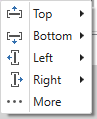
Use this option to specify the margin of a container for all the sides i.e. top, bottom, left and right.
Padding:
Lets you specify the padding of the container from all the sides i.e. top, bottom, left and right.
Border:
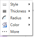
You can use this option to customize the border of a widget/module/block container as show below:
Shadow:
This lets you apply a shadow effect to the container. Click Here for more details.
3 Container Background

Use this to apply a preferred colour, gradient, or image to the container background.
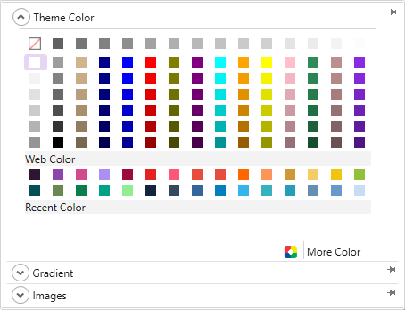
TemplateToaster provides the following additional background options-
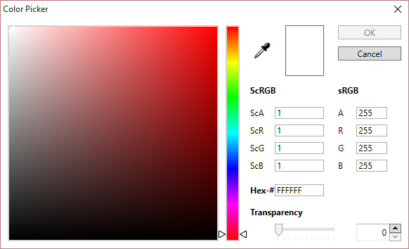
Colour picker-
TemplateToaster gives you a colour picker to choose a background colour. Here is the full detail of a colour picker shown below:
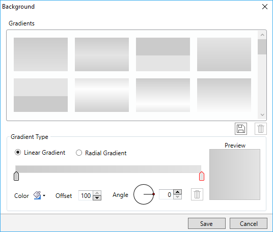
Custom Gradient-
You can create custom gradients with preferred angle, color and offset choices. You can save the gradients as well for future use. See this for more information about creating and saving the custom gradients.
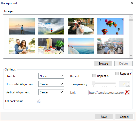
Browse Images-
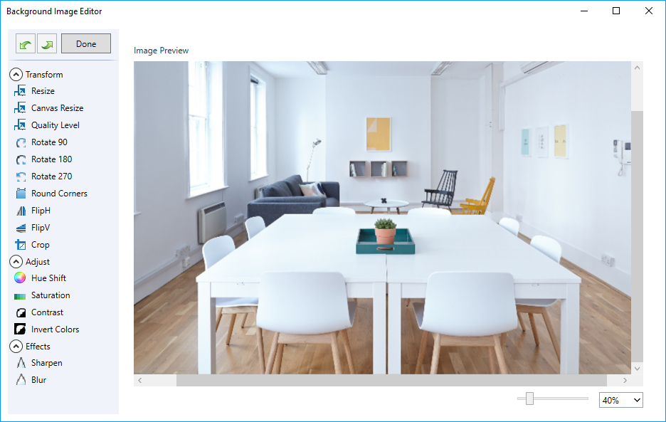
This option lets you apply an image in the background of a Widget/Module/Block container. TemplateToaster has an inbuilt stock of free images to choose from. You can browse and even edit those custom images as needed.
As shown below, TemplateToaster has an image editor with a series of edit options to customize the browsed images. For details, see this.
4 Header Properties

This option lets you set the properties of the Widget header/Module header/Block header as per your preference. TemplateToaster allows to change following properties of a Widget/Module/Block header as shown below:

Show Header-
If you check to select the “Show Header” option it will display the header of Module/Widget/Block.
Icons-
This option will display an icon with the Widget/Module/Block header. For this, you can even browse your own icons.
Margin-
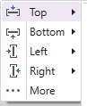
Sets the margin of the header for all the sides i.e. top, bottom, left and right.
Padding-
Specifies the padding of the header from all the sides i.e. top, bottom, left and right.
Heading Type-
To choose the desired heading type (H1, H2….H6) for the Widget/Module/Block header.
5. Header Background
You can select the preferred colour, gradient, or image for the header background with this option as shown below.
In addition, TemplateToaster features following additional background options:
Colour picker-
The TemplateToaster gives you a colour picker option to choose a background colour for the header of a Widget/Block/Module. Here is the full detail.

Custom Gradient-
You can also create custom gradients with a preferred angle, color and offset choices. You can save these gradients as well to use later on. See this for more information on how to create and save the custom gradients.
Browse Images-
Easily apply an image in the background of a Widget/Module/Block header. TemplateToaster has an inbuilt stock of free images that you can quickly add to the background. You can even browse and edit your customized images as required.
As shown below, TemplateToaster has an image editor with many editing options to customize the browsed images. For details, see this.
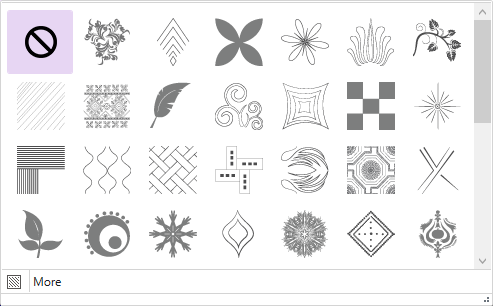
6. Texture
Use this to apply a texture to the background of a Widget/Module/Block header.

More-
You can customize the transparency of a texture using the “More” option. Click Here for more details.
7. Effects
Lets you apply an effect on the sidebar background.
More-
You can customize the transparency of the effect with “More”. Click Here for more details.
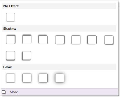
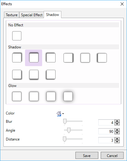
8. Shadow
The option lets you apply a shadow effect to the menu background.
More-
With “More”, you can even customize the colour, angle, blur, and distance of the shadow effect. Click Here for more details.
9. Border
Lets you customize the border of the header. You can change the style of border, thickness of border, radius of the border corners and border colour. See this to know more about designing and customizing the border.
10. Height
Lets you mention the height of the header.

More-
The “More” option is to specify a custom height.

11. Typography
You can change the typography of the Widget/Module/Block header. So you can choose the preferred font, style, font size, font colour, font effect, text alignment and text direction for the Widget/Module/Block header.

More-
This option opens up all the typography options in a single window as shown below.

12. Content Properties


Use this to set the content properties of Widget/Module/Block such as Margin, Padding and Border.
13. Background
Use this to change the background of the content of the Widget/Module/Block.
14. Add Block in Sidebar 1
Manages the number of custom blocks in the first sidebar. You can add as many blocks in the sidebar as you need.

Add-
To add a block, just write the name of the block in the text box and click on the “Add” option.
Delete-
You can delete the block(s) if required. For this, select a block from the drop down menu and click on the “Delete”.
Note: This option is provided when your template type is “WordPress” or “HTML”.
15. Add Block in Sidebar 2
Manages the number of custom blocks in the second sidebar. You can add as many blocks in the sidebar as you need.

Add-
To add a block, just write the name of the block in the text box and click on the “Add”.
Delete-
You can delete the block(s) if required. For this, select a block from the drop down menu and press “Delete”.
Note: This option is provided when your template type is “WordPress” or “HTML”.