Category Archives: Design Your Template

4.14 Widget Areas/Module Position/Regions/Block Reference Tab

The name of the Widget Area tab changes according to the CMS platform you select. Although it serves the same purpose, however the name will change as follows:

Widget Areas:- For WordPress, WooCommerce
Module Position:- For Joomla
Block Reference:- For Drupal, Magento, OpenCart, Prestashop, VirtueMart

Widget Areas/Module Position/Regions/Block Reference Tab

1 Add Row

This option lets you add a Row. You can select the position where you want to add the new row as shown below:

2 Columns

Lets you specify the number of Module-Positions/Widget-Areas/Regions (Columns) in a position row/bar.
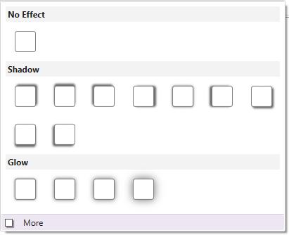
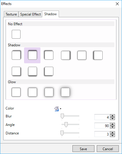
3 Shadow

You can give a shadow effect to the background of the position bar.

More –
You can use the “More” option which lets you customize the colour, angle, blur, and distance of the shadow effect. Here are the more details.

4 Background

Use this option to choose a preferred colour, gradient, or image and apply it to the background of the selected position bar.

TemplateToaster provides you with the follow additional background options-
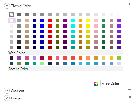
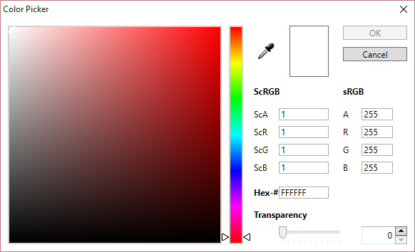
Color Picker-

TemplateToaster gives you a color picker to choose a background colour just the way you want it to be. Here is the full description of the color picker.
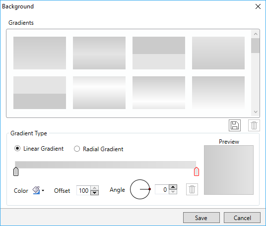
Custom Gradient-
You can create custom gradients with the preferred angle, colour and offset choices. You can save the gradients as well and use it any time later. See this for more information on creating and saving the custom gradients.
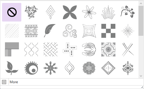
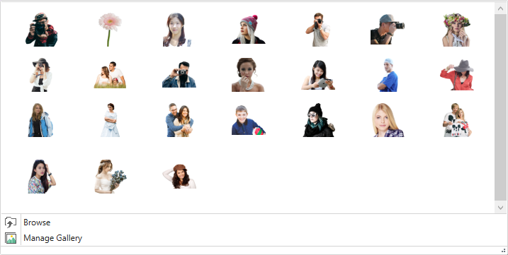
Browse Images-

You can even apply an image to the content background. TemplateToaster has an inbuilt stock of free images to choose from. You can select an image from the stock, or browse your custom images and add it as needed.

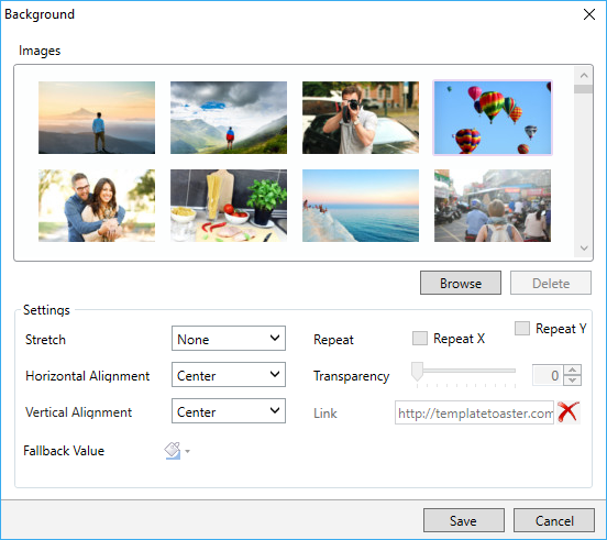
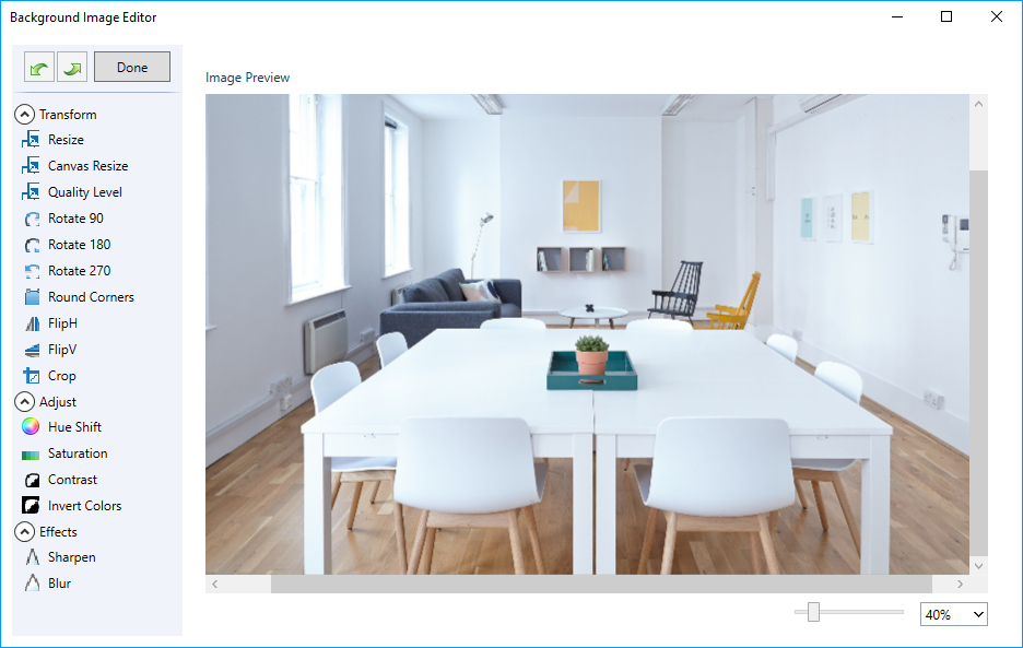
You can even edit the browsed images. TemplateToaster has an image editor with many options to edit and customize the browsed images. For details, see this.

5 Border

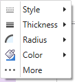
You can also mark the border around the position bar. Also, you can choose the preferred style, thickness, radius of edges, and colour of the border. See this to know the usage of every option given for designing the border.

6 Margin

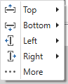
Lets you specify a custom margin for the position bar from top, bottom, left, and right sides.

7 Padding

You can also specify a custom padding for the position bar.

8 Width

Use this to mention the width of the widget equal to Container width, Full width or custom (user-specified width).

9 Add Cell

Lets you add a cell to the selected position bar. Just select a position bar in which you want to add a cell and name it. Then, click OK.

10 Background

You can also change the background of a selected cell of the position bar. And apply a preferred colour, gradient, or image to the background of the cell.

11 Border

Lets you mark a border around the selected cell of a position bar/ position row. You can also set a preferred style, thickness, radius of edges, and colour of the border.

12 Shadow

This option gives a shadow effect to the background of a position cell.

More –
You can use the “More” option to even customize the colour, angle, blur, and distance of the shadow effect. Here are the more details.

13 Margin

Use this to specify the margin for each side of the selected position cell.

14 Padding

You can use this option to specify the padding for each side of the selected position cell.

15 Width

Lets you specify the width of the selected cell. You can change the width of an individual cell according to the need of design. To change the width, just select the cell and click on this option.

16 Widget Areas

You can draw the custom positions in the header, menu, slideshow, and footer. Also you can drag it to any position of the selected element.

17 Background

Use this option to change the background of a custom drew widget area/ module position/ region/block. You can also apply a preferred colour, gradient, or image to the background of selected widget area/module position/ region/block.

18 Border

Use this option to mark the border around the widget area/ module position/ region/ block you’ve drawn. You can also set a preferred style, thickness, radius of edges, and colour for the border.

19 Left

You can specify the selected Widget Position with respect to the left side. And also change the positioning of a widget from left.

20 Top

Use this to specify the selected Widget Position with respect to the top position. You can change the positioning of a widget from the top by clicking on this option.

21 Height

Lets you specify the height of the selected widget. You can change it as per your need.

22 Width

Use this option to specify the width of the selected widget. You can change it as required.
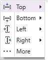
23 Widget Positions

Use the Shortcuts for the different widget positions for the user convenience. The given positions are as:
Horizontal (Left, Center, & Right)
Align Left to Page
Vertical (Top, Center, & Bottom)
Align Right to Page

4.13. Footer Tab

1 Presets

Shows a set of predesigned styles of the footer for you to choose from. You can select from the predesign style options and modify its look as per your need.

2 Layout

Provides you a choice either to display the footer in your template/website or not. Additionally, TemplateToaster also lets you make sticky footer if you need it. You can choose from given footer layout options that best suit your design.

3 Background

Lets you choose a preferred colour, gradient, or image to apply to the background of the footer. Also TemplateToaster features the following additional background options to make your design look fantastic:

Color picker-
TemplateToaster gives you a color picker to choose a background colour as suitable. Here are the details about the color picker.

Custom Gradient-
You can create custom gradients with the preferred angle, colour, and offset choices. You can save the gradients as well and use it later. See this to learn information about creating and saving the custom gradients.

Browse Images-
You can apply an image in the background of the footer as well. TemplateToaster has an inbuilt stock of free images. You can even browse and then edit those custom images and use it in the footer.

TemplateToaster has an image editor with so many option to edit and customize the browsed images. For detailed information, see this.

4 Height

Lets you specify the height of the footer.

More-
Use the “More” option to specify the custom height.

5 Width

You can use this option to change the width of the footer. For this three options are available to specify the width of the footer as given below:

Full Width- Use this to set the width of the footer equal to the width of the browser window.

Equal To Page Width- Makes the width of the footer equal to the width of the page. This option is selected by default but you can change it also.

Custom Width- Lets you mention the custom width of the footer as per your need.

Note: If you have chosen Fixed Width Layout for your template/website, you can set the custom width in pixels. Otherwise, if you have chosen Fluid Width Layout, you can set the custom width in percentage(%).

6 Border

Use this option to design the border of the footer and make it look appealing. You can use Style, Thickness, Radius, and Colour options to customize the border as you want.

More-
The “More” option lets you display even more border customization options. See this to know the usage of every option given for designing the border.

7 Margin

You can specify the margin of the footer for all the sides i.e. top, bottom, left, and right.

More-
You can also specify the custom margins with the “More” option.

8 Texture

Lets you apply a texture to the footer background.

More-
You can also customize the transparency of texture with the “More”. Here are more details on this.

9 Effects

You can also apply an effect on the footer background.

More-
Lets you customize the transparency of the effect with the “More” option. Here are the more details.

10 Shadow

You can also give a shadow effect to the footer background.

More-
With the “More” you can even customize the colour, angle, blur, and distance of the shadow effect. Here are the details.

11 Image

Besides the header background image, TemplateToaster allows you to insert foreground image(s) in the footer to make the template/ website look more professional and amazing. You can apply an image on the footer foreground using this option.

More-
Use the “More”  to link the image to a custom URL. The link can be configured to open in a new window. If you need, you can change the transparency of the image and rotate it around the X or Y axis.

12 Text Areas

Lets you draw the text areas on the footer. You can also add custom text, image, and video in your text area as needed. Just “double click” on the text area to modify its dimensions, add text, add a background image, colour, and a lot more. Text formatting can also be done.

13 Background

Displays a dialog box as shown below. From here, you can apply a colour, gradient, and even an image in the background of a Footer Row.

14 Margin

Use this to specify all of the margins (Top, Bottom, Right, Left) for the Footer Row.

15 Padding

Lets you set the padding for the Footer Row.

16 Add Cell

You can also add a Footer Cell in the position bar of the footer area. You can add as many cells as you require.

17 Delete a Cell

Use this option to delete a cell from the position bar of the footer area.

18 Width

Lets you specify the width of the footer cell. You can change the width of an individual cell according to the need of the design. To change the width, just select the cell and click on this option.

19 Columns

Use this to specify the number of columns you want, in the position bar of the footer area.

20 Border

Lets you design the border of the footer cell. You can use Style, Thickness, Radius, and Colour options to customize the border.

More-
You can use the “More”  option to display more border customization options. See this for details.

21 Margin

Lets you specify the margin of the footer cell for all the sides i.e. top, bottom, left, and right.

More-
You can use this option to specify the custom margins with “More”.

22 Padding

Use this to specify the padding for the Footer Cell from all the sides (Top, Bottom, Left, Right).

23 Show/Hide Copyright

Gives a choice either to hide or show the copyright text in your template/ theme or website design.

24 Designed by Text

Use this to hide/show the “Designed by” text in your template/  theme or website design.

25 Designed By Link

Gives the choice to hide/show the “Designed by” link in your template/ theme or  website design.

26 Social Icons

You can configure social media accounts in the footer of your template, theme or website. For this, you can choose the icons from the inbuilt icon gallery or you can browse your own custom social media icons and easily add them also.

27 Typography

Lets you define the typography for the Headings, Text, Lists, Links of the footer area.

Headings

Use this to edit the text style of the headings used in the footer. You can also do following changes like Font Family, Style, Colour etc. in the typography of the headings.

Text

Use this option give a personalized look and feel to the text styles of any plain text that you’ll write in the footer area.

Lists

Usually lists provide a much better way to display data. You can create both, ordered and unordered lists in your template, theme or website. An ordered list is represented with numbers, alphabets while an unordered list with Bullets, Disc, etc. Using this option, you can format the styles of ordered/unordered lists.

Links

Lets you easily set the typography for links in the footer section for all the three states as Active, Normal, Hover. You can also make the following changes to customize a typography pattern.

Here as shown above the ‘More’ option allows you to choose the text format and effects for font.

4.12.10. Content Tab for VirtueMart in TemplateToaster

1 Background

Use this option to apply a preferred colour, gradient, or image to the content background as you require.

TemplateToaster features the following additional background options for you to choose and customize the look and feel of the background:

Colour Picker-

TemplateToaster provides a color picker to choose a background colour. Here is the full description of it.

Custom Gradient-
You can create custom gradients with preferred angle, colour, and offset choices. You can save the gradients as well and use it anytime later. See this for more information about creating and saving the custom gradients for future use.

Browse Images-
You can even apply an image to the content background. TemplateToaster presents an inbuilt stock of free images to choose from. You can also select an image from the stock, or browse your custom images and add it.

You can even edit the browsed images as needed. TemplateToaster has an image editor with many options  to edit and customize the browsed images. For details, see this.

2 Border

Use this option to mark the border around the content and modify its properties such as Style, Thickness, Radius and Colour. See this to know more.

3 Margin

Lets you specify the margin of the content for all the sides i.e. top, bottom, left, and right.

4 Padding

You can also specify the padding from the top, bottom, left, and right padding of the content.

5 Texture

Use this to apply a texture to the content background.

More-
You can use this option to customize the transparency of texture with “More”. Click Here for more details.

6 Effects

Use this to give an effect to the content background.

More-
You can use this to customize the transparency of the effect using the “More” option. Click Here for more details.

7 Shadow

Lets you apply a shadow effect to the content background.

More-
With the “More”, you can even customize the colour, angle, blur, and distance of the shadow effect. Click Here for more details.

8 Background

You can also apply a preferred colour, image, or gradient in the background as needed. TemplateToaster provides predesigned gradients and stock images. Also, you can create the custom gradients or browse your own images.

9 Border

You can also mark the border for the product which you can customize also. For customizing the border, you can have Style, Thickness, Radius (of edges), and Colour options.

10 Margin

Lets you specify all side margins i.e. Top, Bottom, Left and Right.

11 Padding

You can also specify the padding from all the sides i.e. Top, Bottom, Left and Right.

12 Texture

Lets you apply a texture to the background of the product.

More-
You can also customize the transparency of texture with the “More” option.

13 Effects

You can apply an effect to the background of the product.

More-
You can customize the transparency of the effect using the “More” option.

14 Shadow

Use this to apply a shadow effect to the background of the product.

More-
With the “More” option you can even customize the colour, angle, blur, and distance of the shadow effect.

15 Title

You can use this to set the typography of the Product Title Container.

16 Content

Lets you customize the Product Content by specifying different properties like Background, Border, List layout, Typography, and much more as shown below:

17 Columns

You can specify the number of product columns on a single page.

18 Image Border

Allows you to customize the product image border by specifying its Thickness, Style, Color etc.

19 Cart

Lets the user specify the style and alignment of the Add To Cart button as per user preferences.

20 Price

Use the Text styling of Product Price by specifying different properties like Font Family, Thickness, Colour, and much more.

21 Links

You can define the typography of post title, metadata, metalinks, and content for different states like Link and Link Hover and align the links.

4.12.9. Content tab for Prestashop in TemplateToaster

1 Background

Use this to apply a preferred color, gradient, or image to the content background.

TemplateToaster features the following additional background options so that you can customize the background just the way you like-

Colour Picker-

TemplateToaster provides a colour picker to choose a background colour. and customize the look and feel of the background Here is the full description of it.

Custom Gradient-
You can create custom gradients with the preferred angle, colour, and offset choices. You can save the gradients as well and use it later. See this for more information about how to create and save the custom gradients.

Browse Images-
You can even add an image to the content background. TemplateToaster provides you with an inbuilt stock of free images to choose from. You can also select an image from the stock, or browse your custom images and add it to the background.

You can even edit the browsed images. TemplateToaster has an image editor with a dozen of edit options to customize the browsed images. For details, see this.

2 Border

Use this option to mark the border around the content and modify its properties such as Style, Thickness, Radius and Colour. See this to know more.

3 Margin

You can specify the margin of the content for all the sides i.e. top, bottom, left, and right.

4 Padding

Specifies the top, bottom, left, and right padding of the content.

5 Texture

Use this to apply a texture to the content background.

More-
You can use this to customize the transparency of texture with “More” option. Click Here for more details.

6 Effects

Use this to give an effect to the content background.

More-
You can also customize the transparency of the effect using “More”. Click Here for more details.

7 Shadow

Lets you apply a shadow effect to the content background.

More-
With the “More” you can even customize the colour, angle, blur, and distance of the shadow effect. Click Here for more details.

8 Background

Use this option to apply preferred colour, image, or gradient in the background. TemplateToaster provides predesigned gradients and stock images. Also, you can create the custom gradients or browse your own images and add it.

9 Border

Lets you mark the border for the product which you can customize also. For customizing the border, you can choose Style, Thickness, Radius (of edges), and Colour options.

10 Margin

Use this to specify all side margins i.e. Top, Bottom, Left and Right.

11 Padding

You can also specify the padding from all the sides i.e. Top, Bottom, Left and Right.

12 Texture

Lets you apply a texture to the background of the product.

More-
You can also customize the transparency of texture with the “More” option.

13 Effects

Lets you apply an effect to the background of the product.

More-
You can customize the transparency of the effect using  the “More” option.

14 Shadow

You can use this to apply a shadow effect to the background of the product.

More-
With the “More” option you can even customize the colour, angle, blur, and distance of the shadow effect.

15 Title

Use this to set the typography of the Product Title Container.

16 Content

Lets you customize the Product Content by specifying different properties like Background, Border, List layout, Typography, and much more as shown below:

17 Columns

Use this to specify the number of product columns on a single page.

18 Image Border

Lets you customize the product image border by specifying its Thickness, Style, Color etc.

19 Cart

This option lets the user specify the style and alignment of the Add To Cart button as per user preferences.

20 Price

Use this for text styling of Product Price by specifying different properties like Font Family, Thickness, Color, and much more.

21 Links

You can define the typography of post title, metadata, metalinks, and content for different states like Link and Link Hover and align the links using this option.

4.12.8. Content tab for OpenCart in TemplateToaster

1 Background

Use this to apply a preferred colour, gradient, or image to the content background.

TemplateToaster features the following advanced background options for customization-

Colour Picker-

TemplateToaster provides a colour picker to choose a background colour. Here is the complete details to know about.

Custom Gradient-
You can also create custom gradients with the preferred angle, colour, and offset choices. You can save the gradients as well and use it later. See this for more information on creating and saving the custom gradients.

Browse Images-
You can even browse and apply an image to the content background. TemplateToaster presents an inbuilt stock of free images to choose from. You can select an image from the stock options, or browse your custom images and add it to the background.

You can also edit the browsed images and make it look just the way you want. TemplateToaster has an image editor with many options to edit to customize the browsed images. For details, see this.

2 Border

Use this option to mark the border around the content and modify its properties such as Style, Thickness, Radius and Color. See this to know more.

3 Margin

Lets you specify the margin of the content for all the sides i.e. top, bottom, left, and right.

4 Padding

Lets you specify the top, bottom, left, and right padding of the content.

5 Texture

You can use this to apply a texture to the content background.

More-
You can customize the transparency of texture with the “More” option. Click Here for more details.

6 Effects

Use this to give an effect to the background of the content.

More-
You can customize the transparency of the effect using the “More” option. Click Here for more details.

7 Shadow

You can use this to apply a shadow effect to the content background.

More-
With the “More” option you can even customize the colour, angle, blur, and distance of the shadow effect. Click Here for more details.

8 Background

You can use this to apply a preferred colour, image, or gradient in the background. TemplateToaster provides predesigned gradients and stock images. Also, you can create the custom gradients or browse your own images and add them.

9 Border

Marks a border for the product which you can customize too. For customizing the border, you can have Style, Thickness, Radius (of edges), and Colour options.

10 Margin

You can specify all side margins i.e. Top, Bottom, Left and Right.

11 Padding

Lets you specify the padding from all the sides i.e. Top, Bottom, Left and Right.

12 Texture

Use this to apply a texture to the background of the product.

More-
You can customize the transparency of texture with “More” option.

13 Effects

You can apply an effect to the background of the product.

More-
You can customize the transparency of the effect using “More” option.

14 Shadow

Lets you apply a shadow effect to the background of the product.

More-
With the “More” option you can even customize the colour, angle, blur, and distance of the shadow effect.

15 Title

Lets you set the typography of the Product Title Container .

16 Content

With the customization of Product Content by specifying different properties like Background, Border, List layout, Typography, and much more as shown below:

17 Columns

With this you can specify the number of product columns on a single page.

18 Image Border

Use this to customize the product image border by specifying its Thickness, Style, Color etc.

19 Cart

You can avail the user to specify the style and alignment of Add To Cart button as per user preferences.

20 Price

You can use this to set text styling of Product Price by specifying different properties like Font Family, Thickness, Color, and much more.

21 Links

Lets you define the typography of post title, metadata, metalinks, and content for different states like Link and Link Hover and align the links.

4.12.7. Content Tab for Magento in TemplateToaster

The Content Tab in Magento CMS offers the following options to design the content area. Here is the function of each option of this tab.

1 Background

Use this option to apply a preferred colour, gradient, or image to the background of the content.

You can use these TemplateToaster features with the following additional background options-

Colour Picker-

With TemplateToaster you can find a colour picker to choose the background colour. Here is the full description of it.

Custom Gradient-
You can create custom gradients with the preferred angle, colour, and offset options. You can save the gradients as well and use it later. See this for more information on how to create and save the custom gradients.

Browse Images-
You can also apply an image to the content background. The TemplateToaster provides you with an inbuilt stock of free images to choose from. You can select an image from the stock, or browse your custom images also.

You can also edit the browsed images. TemplateToaster has an image editor with numerous editing options to customize the browsed images. For details, see this.

2 Border

Use this option to mark the border around the content and modify its properties such as Style, Thickness, Radius and Colour. See this to know more.

3 Margin

Lets you specify the margin of the content for all the sides i.e. top, bottom, left, and right.

4 Padding

Use this option to specify the top, bottom, left, and right padding of the content.

5 Texture

You can use this to apply a texture to the content background.

More-
You can use this option to customize the transparency of texture with “More”. Click Here for more details.

6 Effects

Use this option to give an effect to the content background.

More-
Use the option to customize the transparency of the effect using “More”. Click Here for more details.

7 Shadow

Lets you apply a shadow effect to the content background.

More-
With the “More” option you can even customize the colour, angle, blur, and distance of the shadow effect. Click Here for more details.

8 Background

Lets you apply a preferred colour, image, or gradient in the background. TemplateToaster provides predesigned gradients and stock images to choose from. Also, you can create the custom gradients or browse your own images and use them.

9 Border

Use this option to mark border for the product which you can customize also. For customizing the border, you can have Style, Thickness, Radius (of edges), and Colour options.

10 Margin

Use this option to specify all of sides of the margins i.e. Top, Bottom, Left and Right.

11 Padding

You can also specify the padding from all the sides i.e. Top, Bottom, Left and Right.

12 Texture

Use this to apply a texture to the background of the product.

More-
You can use this option to customize the transparency of texture with “More”.

13 Effects

Lets you apply an effect to the background of the product.

More-
You can also customize the transparency of the effect using the “More” option.

14 Shadow

Use this to apply a shadow effect to the background of the product.

More-
With the “More” option you can even customize the colour, angle, blur, and distance of the shadow effect.

15 Title

Lets you set the typography of the Product Title Container .

16 Content

You can customize the Product Content by specifying different properties like Background, Border, List layout, Typography, and much more as shown below:

17 Columns

Lets you specify the number of product columns on a single page.

18 Image Border

Use this to customize the product image border by specifying its Thickness, Style, Colour etc.

19 Cart

You can avail the user to specify the style and alignment for Add To Cart button as per user preferences.

20 Price

Use this option for Text styling of Product Price by specifying different properties like Font Family, Thickness, Colour, and much more.

21 Links

Lets you define the typography of post title, metadata, metalinks, and content for different states like Link and Link Hover and align the links.

4.12.6. Content tab for WooCommerce in TemplateToaster

1 Background

Use this option to apply preferred colour, gradient, or image to the content background.

TemplateToaster features the following additional options for the background-

Colour Picker-

TemplateToaster provides a colour picker to choose a background colour. Here is the full description of it.

Custom Gradient-
You can create custom gradients with the preferred angle, colour, and offset choices. You can save the gradients as well and use it later. See this for more information about creating and saving the custom gradients.

Browse Images-
You can even apply an image to the content background through the browse image option. TemplateToaster presents an inbuilt stock of free images which you can use. You can select an image from the stock, or browse your custom images and add them to the background.

You can even edit the browsed images. TemplateToaster has an image editor with so many options to edit the custom  browsed images and help you easily customize the images just the way you want. For details, see this.

2 Border

Marks a border around the content which you can customize too. For customizing the border, you can choose Style, Thickness, Radius (of edges), and various Colour options.

3 Margin

Use this to specify all side margins i.e. Top, Bottom, Left and Right.

4 Padding

Use this to specify the top, bottom, left, and right padding of the content.

5 Texture

Lets you apply a texture to the content background.

More-
You can customize the transparency of texture with the “More” option.

6 Effects

Use this to give an effect to the content background.

More-
Also you can customize the transparency of the effect using the “More” option. Click Here for more details.

7 Shadow

Use this to apply a shadow effect to the content background.

More-
With “More”, you can even customize the colour, angle, blur, and distance of the shadow effect. Click Here for more details.

8 Page Title

Allows the user to choose whether to show or hide the Page Title. By default, this is checked. But you can also unselect the option.

9 Heading

Allows you to show the list of all the headings from h1 to h6. And you can choose the suitable one for the page title for user convenience.

10 Typography

Lets you define the typography of the Page Title by specifying various options like Font Family, Style, Color, Margin, and much more as shown below:

“More” option allows you to facilitate the user to customize Text Formats and Effects for the Page Title.

11 Background

You can select to apply a preferred colour, image, or gradient in the background as needed. TemplateToaster provides predesigned gradients and stock images. Also, you can create the custom gradients or browse your own images and add it.

12 Border

You can also mark the border for the product which you can also customize. For editing and customizing the border, you can choose Style, Thickness, Radius (of edges), and Colour options.

13 Margin

Lets you specify all the side margins i.e. Top, Bottom, Left and Right.

14 Padding

Lets you mention the padding option from all the sides i.e. Top, Bottom, Left and Right.

15 Texture

Use this to apply  texture to the background of the product.

More-
You can customize the transparency of texture with the “More” option.

16 Effects

Use this to apply an effect to the background of the product.

More-
You can customize the transparency of the effect using the “More” option.

17 Shadow

You can apply a shadow effect to the background of the product.

More-
With the “More”option you can even customize the colour, angle, blur, and distance of the shadow effect.

18 Title

Lets you set the typography of Product Title Container.

19 Content

Use this for customization of the Product Content by specifying different properties like Background, Border, List Layout, Typography, and much more as shown below:

20 Columns

Use this to specify the number of product columns on a single page.

21 Image Border

This option customizes the product image border by specifying its Thickness, Style, Colour etc.

22 Cart

Use this option to avail the user to specify the style and alignment of Add To Cart button as per user preferences.

23 Price

Use this for Text styling of Product Price by specifying different properties like Font Family, Thickness, Colour, and much more.

4.12.5. Content tab for HTML in TemplateToaster

1 Page Title

Allows the user to make a choice either to show or hide the Page Title. By default, this is checked but you can also unselect the option.

2 Heading

Lets you specify and add the heading. You can choose the headings as H1 to H6 for the page title for user convenience and readability purposes.

3 Typography

Use this option to define the typography of the Page Title by specifying various options like Font Family, Style, Colour, Margin and many more as shown below:

The “More” option allows the user to customize Text Formats and Effects for the Page Title.

4 Background

You can use this option to apply a preferred colour, gradient, or image to the background of the content of your HTML website. TemplateToaster gives following options to design the content of your website in a professional style:

Colour picker-

You can use the colour picker to apply background colour as required.

Custom Gradient-
You can apply a custom gradient in the background as needed. Also select the preferred angle, colour, and offset choices for creating your own gradient style. You can save the gradient for later use as well.

Browse Images-
You can apply an image in the background of content as you need. TemplateToaster has an inbuilt stock of free images to choose from. You can browse your custom images too and add them.

You can even edit the browsed images as needed. TemplateToaster has an image editor with many options to edit and to customize the browsed images.

5 Border

Use this to mark a border around the content area. You can set a preferred style, thickness, radius of edges, and colour for the content border.

6 Margin

Lets you set the margin for each side of the content area as needed.

7 Padding

You can specify the padding for each side of the content area.

8 Add a Row

Use this to add a row in the content area.

9 Delete a Row

You can also delete a row from the content area.

10 Columns

Lets the user specify the number of columns to keep in a row.

11 Background

You can also apply a preferred colour, gradient, or image to the background of a row.

12 Border

Use this to mark a border around the selected row of the content area. You can set a preferred style, thickness, radius of edges, and colour for the border of a selected row.

13 Shadow

You can also apply a shadow effect to the border of a selected row.

14 Margin

You can use this to specify the margin for each side of the row.

15 Padding

Lets you mention the padding for each side of the row.

16 Add a Cell

Adds a cell in the row.

17 Delete a Cell

Deletes a cell from the row.

18 Width

Changes the width of a selected cell. You can change the width of an individual cell according to the need of your design. To change the width, just select the cell and click on this option.

19 Background

Use this to apply the background to the selected row of the content area. You can also apply a preferred colour, gradient, or image to the background of a cell.

20 Border

Marks a border around the selected cell of a row. And, you can also choose a preferred style, thickness, radius of edges, and colour for it as needed.

21 Margin

Use this to specify the margin for each side of a cell.

22 Padding

Mention the padding for each side of a cell.

23 Shadow

Use this to apply a shadow effect in the content background of the selected cell.

More-
With “More”, you can even customize the colour, angle, blur and distance of the shadow effect. Click Here for more details.

4.12.4. Content tab for Blogger in TemplateToaster

1 Presets

You can select  a predesigned style for the blog posts using this option.

2 Background

Use this option to apply preferred colour, gradient, or image to the content background.

TemplateToaster features the following extended background options-

Colour Picker-

TemplateToaster provides a color picker to choose a background color. Here is the full description of it.

Custom Gradient-
You can create custom gradients with preferred angle, colour, and offset choices. You can save the gradients as well to use later. See this for more information about creating and saving the custom gradients.

Browse Images-
Also you can even apply an image in the content background as needed. TemplateToaster offers you an inbuilt stock of free images to choose from. You can select an image from the stock, or browse your custom images as required.

You can even edit the browsed images. TemplateToaster has an image editor with so many editing options to customize the browsed images. For details, see this.

3 Border

Use this to mark the border around the content and modify its properties such as Style, Thickness, Radius and Color. See this to know more.

4 Margin

Lets you specify the margin of the content for all the sides i.e. top, bottom, left, and right.

5 Padding

You can specify the top, bottom, left, and right padding of the content.

6 Texture

You can apply this to a texture to the content background.

More-
You can customize the transparency of texture with the “More” option. Click Here for more details.

7 Effects

Use this to give an effect to the content background.

More-
Lets you customize the transparency of the effect using “More”. Click Here for more details.

8 Shadow

You can also apply a shadow effect to the content background.

More-
With the “More” option you can even customize the colour, angle, blur, and distance of the shadow effect. Click Here for more details.

9 Background

You can apply a preferred color, image, or gradient in the background. TemplateToaster provides predesigned gradients and stock images to choose from. Also, you can create the custom gradients or browse your own images.

10 Border

Marks a border for the post which you can customize too. For customizing the border, you can have Style, Thickness, Radius (of edges), and use the Colour options.

11 Margin

Use this option to specify all of the side margins i.e. Top, Bottom, Left and Right.

12 Padding

Lets you specify the padding from all the sides i.e. Top, Bottom, Left and Right.

13 Texture

Use this to apply a texture to the background of the post.

More-
You can customize the transparency of texture with the “More” option.

14 Effects

Use it to apply an effect to the background of the post.

More-
You can customize the transparency of the effect using the “More” option.

15 Shadow

Lets you apply a shadow effect to the background of the post.

More-
With the “More”, you can even customize the colour, angle, blur, and distance of the shadow effect.

16 Metadata

You can specify various properties as follows:

Show Metadata- To Show/Hide Metadata
Typography- Sets the typography of Metadata
Title- Defines the text style of Post Title
Title Hover- Text styling of title on hover
Icon- Contains the icons for Author, Date, Post Headline

17 Product Title

Sets the typography of Product and Post Title Containers .

18 Content

Customization of Content by specifying different properties like Background, Border, List layout, Typography, and much more as shown below:

19 Columns

Use this to mention the number of post columns on a single page.

20 Featured Posts

Lets you show/hide Featured Posts.

21 Background

You can use this to apply a preferred colour, gradient, or image to the comment form background.

TemplateToaster features the following extended background options-

Colour Picker-

TemplateToaster provides a colour picker to choose a background colour. Here is the full description of it.

Custom Gradient-
You can create custom gradients with preferred angle, colour, and offset choices. You can save the gradients as well and use it later. See this for more information about creating and saving the custom gradients.

Browse Images-
You can even apply an image in the background. TemplateToaster presents an inbuilt stock of free images. You can select an image from the stock, or browse your custom images and use them in the background.

You can even edit the browsed images. TemplateToaster has an image editor with numerous editing options to customize the browsed images. For details, see this.

22 Border

Marks the border around the comment form and modify its properties such as Style, Thickness, Radius and Colour. See this to know more.

23 Margin

Lets you specify the margin for all the sides i.e. top, bottom, left, and right.

24 Padding

Use this to specify the top, bottom, left, and right padding of the comment form.

25 Shadow

You can apply a shadow effect to the form background.

More-
With “More” option you can even customize the colour, angle, blur, and distance of the shadow effect. Click Here for more details.

26 Typography

Use this option to define the text style of Comment form content by specifying Font Family, Font Colour, Size etc.

4.12.3. Content Tab for Drupal in TemplateToaster

1 Presets

The Preset option lets you choose a predesigned style for the content.


2 Background

Use this option to apply a preferred colour, gradient, or image to the content background.

TemplateToaster features the following additional background options for you to choose from-

Colour Picker-

TemplateToaster offers a colour picker to choose a background colour. Here is the full description of it.

Custom Gradient-
You can create custom gradients with preferred angle, color, and offset choices. You can save the gradients as well and use it later. See this for more information about creating and saving the custom gradients.

Browse Images-
You can even apply an image to the content background. TemplateToaster presents an inbuilt stock of free images. You can select an image from the stock, or browse your custom images also.

You can even edit the browsed images. TemplateToaster has an image editor with a series of editing options to customize the browsed images and create them just the way you want. For details, see this section.

3 Border

Use this to mark the border around the content and modify its properties such as Style, Thickness, Radius and Color. See this to know more.

4 Margin

This option is to specify the margin of the content for all the sides i.e. top, bottom, left, and right.

5 Padding

Use this option to specify the top, bottom, left, and right padding of the content.

6 Texture

Add texture to the content background using this option.

More-
You can customize the transparency of texture with the “More”.

7 Effects

Use this to give an effect to the content background.

More-
You can also use this option to customize the transparency of the effect using “More”. Click Here for more details.

8 Shadow

Use this to apply a shadow effect to the content background.

More-
With the “More” option you can even customize the colour, angle, blur, and distance of the shadow effect. Click Here for more details.

9 Background

This option lets you apply a preferred colour, image, or gradient in the background. TemplateToaster provides predesigned gradients and stock images. Also, you can create the custom gradients or browse your own images as needed.

10 Border

Marks a border for the post which you can customize also. For customizing the border, you can choose custom Style, Thickness, Radius (of edges), and Colour options.

11 Margin

Lets you specify all of the side margins i.e. Top, Bottom, Left and Right.

12 Padding

You can also specify the padding from all the sides i.e. Top, Bottom, Left and Right.

13 Texture

Use this to apply a texture to the background of the post.

More-
Lets you customize the transparency of texture with “More” option.

14 Effects

You can use this option to apply an effect to the background of the post.

More-
You can customize the transparency of the effect using “More” option.

15 Shadow

Use this option to apply a shadow effect to the background of the post.

More-
With the “More” option you can even customize the colour, angle, blur, and distance of the shadow effect also.

16 Title

The option lets you customize the Post Title in Normal and hover states by specifying different properties .

17 Content

You can customize the Content by specifying different properties like Background, Border, List layout, Typography, and much more as shown below:

18 Columns

Use this option to specify the number of post columns on a single page.

19 Featured Posts

Lets you show/hide the Featured Posts.

20 Background

Use this to apply a preferred colour, gradient, or image to the comment form background.

TemplateToaster features the following extended background options-

Colour Picker-

TemplateToaster provides a colour picker to choose a background color just the way you want. Here is the full description of it.

Custom Gradient-
You can create custom gradients with the preferred angle, colour, and offset choices. You can save the gradients as well and use it later. See this for more information about creating and saving the custom gradients.

Browse Images-
You can even apply an image in the background. TemplateToaster presents an inbuilt stock of free images. You can select an image from the stock, or browse your custom images as needed.

You can even edit and customize the browsed images. TemplateToaster has an image editor with many editing options to customize the browsed images. For details, see this.

21 Border

Use this to mark the border around the comment form and modify its properties such as Style, Thickness, Radius and Colour as needed. See this to know more.

22 Margin

Lets you specify the margin for all the sides i.e. top, bottom, left, and right.

23 Padding

Use this option to specify the top, bottom, left, and right padding of the comment form.

24 Shadow

Lets you apply a shadow effect to the form background.

More-
With the “More” option, you can even customize the colour, angle, blur, and distance of the shadow effect. Click Here for more details.

25 Typography

Lets you define the text style of Comment form content by specifying Font Family, Font Color, Size etc.

26 Background

You can choose to apply a preferred colour, image, or gradient in the background of the comment. TemplateToaster provides predesigned gradients and stock images. Also, you can create custom gradients or browse your own images to apply in the background as you need.

27 Shadow

Use this to apply a shadow effect to the background of the Comment.

More-
With the “More”, you can even customize the colour, angle, blur, and distance of the shadow effect as you require.

28 Typography

Lets you define the text style of Comment by specifying Font Family, Font Color, Size etc.

29 Margin

Use this option to specify the margin for all the sides i.e. top, bottom, left, and right.

30 Padding

Lets you mention the top, bottom, left, and right padding of the comment element.

31 Border

Use this option to mark the border around the comment and modify its properties such as Style, Thickness, Radius and Color. See this to know more.

32 Show Image

You can show or hide the image ( also called avatar) with the comment.

33 Image Position

Fix the image position. Use this option to align the image in left/ right of the comment.

34 Image Border

Customizes the image border by specifying its Thickness, Style, Radius etc.