In this field, specify the admin email address on which the messages will be sent. For example, if you want all the messages to be sent on your email address, then fill in your email address in this field.
2 Set Margin
You can set a custom margin of Contact form from all the sides. The margin will be the same from all sides if the” Select All” option is checked. Uncheck ” Select All” to specify different margin for all sides i.e. Top, Bottom. Left, & Right.
3 Contact Form fields
These Contact Form Fields are added by default. You can add more fields as needed.
4 Apply Validation Rule
Click the drop down arrow and select a validation rule for the field. There are four option to select the validation rule as No Validation, Email, Numeric, and URL. Validation text lets you provide a message to help the users whose input data that is not correct.
5 Required Field
This icon signifies that the particular field is mandatory. To make a field mandatory, just click the “star icon” shown besides the field.
6 Add New Field
Click on this button to add a new field in your contact form.
7 Delete
Use this option you can delete the contact form field.
8 Typography Tab
From this tab, you can change the text style of the labels used in the contact form.
9 Button Tab
Lets you select the type of the button you want to use on your contact form.
10 Message Field
It facilitates a message box in the contact form that provides a text area for the user to write the message.
11 Enable Attachments
If enabled, the Enable Attachments option allows the user to attach the file with restricted extensions using the Browse button option. And also mention the size of the attachment as specified by you in the corresponding fields. You will also be able to define the Browser typography if Enable Attachment is checked as shown below:
12 OK
Click on the OK button to add the contact form in the template/website with changes applied.
13 Cancel
Use the Cancel option to rule out all of the changes and close the dialog box.
In this field, you can write the text that you want to display on the button. For example, “More Info”, “Submit”, ” Cancel” etc.
2 External URL
The radio button is to choose between External URL and Internal Pages. You can also choose where to place the button.
If you select External URL, then you need to specify the URL you want to link with this button.
If you go for Internal Pages, it will display the list of all the pages that you have made for the site/template design. And you can select any out of these.
3 Open In
Use this to select the target window in which the specified URL will open.
4 Style
Lets you choose a preferred BOOTSTRAP button style from the given options. You can find six BOOTSTRAP button styles to choose from – Default, Primary, Success, Info, Warning, and Danger. You can select the one that best suits you.
5 Size
Use this to specify the size of the button. You can choose between the given four options available for size as- Medium, Large, Small and Extra Small.
6 Save
You can click on the Save button to apply the changes.
7 Cancel
Click on the Cancel button to cancel the changes and close the dialog box.
Use this option to specify the URL of the YouTube video you want to add in this field.
2 Change the Layout
You can change the height and width of the video container. By default, “Maintain Aspect Ratio” option is checked. Hence, if you change the height then width will also change automatically. If you uncheck this option then you can set height and width of the video container separately as required.
3 Set Margin
Using this option you can specify the margin of the video from all the sides i.e. Left, Right, Top, & Bottom. The margin will be the same from all the sides if you choose the “Select All” option and check it. Uncheck this to specify different margins for all the sides.
4 OK
Click on “OK” to apply the changes.
5 Cancel
Click on the “Cancel” option to cancel the changes and close the dialog box.
You can use this option to specify how the image should stretch.
4 Layout
Using the Layout option can specify the height and width of the image. By default, “Maintain Aspect Ratio” option is checked. Hence, if you change the height then width will also change automatically. If you uncheck this option, then you can set height and width of the image separately as needed.
5 Margin
Sets the margin of the image from all sides. Uncheck “Select All” to specify individual margin for all the sides as Top, Bottom, Left, and Right.
6 OK
Click on the “OK” option to apply the changes you have made.
7 Cancel
Click on the “Cancel” option to cancel the changes you made and close the dialog box.
This dialog box brings all the typography options at one place. You can change the text styles of individual elements very easily.
1 Selection Radio Button
Allows you to choose the element with which you want to define the typography. Here is what happens if choose the following-
Complete – You can customize the typography for any element from the list given in the extreme left of the window.
Headings- It will let you specify the typography of headings only while making the list of elements inactive.
Text- It will allow you to define the styling of text only.
2 List of Elements
From the given list, you can choose the element whose text style you want to change.
3 Google Web Fonts
From this list, you can select any Google font for your website. And if you want to browse more fonts online, Click on the “Google Fonts” button.
4 Custom Fonts
This is the list of custom fonts, you can select any font from the given list. Click on the ” Browse” button to browse and find more custom fonts.
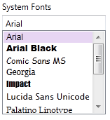
5 System Fonts
If you want to use a system font for your website, you can select the preferred font from the shown list.
6 List of Font Styles
You can choose the preferred style for the chosen font from this list of font styles.
7 Font Size Options
From this list, you can choose suitable font size as needed.
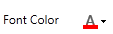
8 Change Font Color
You can choose a suitable color for the text with this tool.
9 Alignment
Use this option to modify the alignment of the text. According to the need of your template/theme or website, you can set the alignment of the text.
10 Margin
Specifies the margin of the text. You can mention the Top and Bottom Margins.
11 Select Font Effect
Use this option to choose an underline or strike through style for the text.
12 Text Preview
This option lets you preview the text style.
13 Save
Applies the text styles and saves it.
14 Cancel
Cancels the changes you have done and closes the dialog box.
Use this option to choose a suitable style for the border.
2 Select Border Thickness
Changes the thickness from all sides of the border. including Top, Bottom, Left, &, Right. Uncheck “Select All”, if you want to set different values for each side of the border.
3 Change the Radius of Corners
Specifies the radius of the corners including Top Right, Top Left, Bottom Right, & Bottom Left. Uncheck “Select All”, if you want to set different values for each side of the border.
4 Select Border Color
Use this to modify the color of the border.
5 Save
Lets you apply the changes you made to the border.
6 Cancel
Use this to Cancel the changes you have made and close the dialog box.
Use this option to apply a shadow effect. You can apply one of the shadow effects from the given options by TemplateToaster. Also you can even personalize the features of shadow effect by using colour, blur, angle, and distance options as needed.
2 No Effect
If you do not want to apply any shadow effect, select the No Effect option.
3 Shadow Effects
Lets you apply a suitable shadow effect from these options. You can select the one that is best suitable.
4 Glow
You can choose any suitable glow effect from these options.
5 Color
Use this option to specify the colour for the shadow effect.
6 Blur
You can also blur the shadow using this slider or numeric up down option as suitable.
7 Angle
Use this option to specify an angle between the element and the shadow. You can use the slider or numeric up down to change the value of the angle as needed.
8 Distance
Changes the apparent distance between the element and the shadow. You can use the slider or numeric up down to change the value of the distance.
9 OK
Click on the OK button to apply the texture.
10 Cancel
Click on the Cancel button to drop the changes and close the dialog.
Use this option to apply different types of the special effects to the background. Special Effects are like textures with some different set of effects. To preview different special effects, hover your mouse cursor on different special effects, and select the best suited special effect for the background. Adding special effects to the background makes it look more attractive and appealing.
2 Transparency
You can select the desired transparency level of the texture. It is pretty simple to add transparency using this option.
3 OK
Next click on the OK button to apply the texture.
4 Cancel
Click on the Cancel button to drop the changes and close the dialog.


